
A 2-page high color sell sheet, but no letter!
When you are on the marketing end, you may feel that direct mail, especially fundraisers and business mail, looks pretty vanilla. Maybe even bland.
So the urge is to pretty it up.
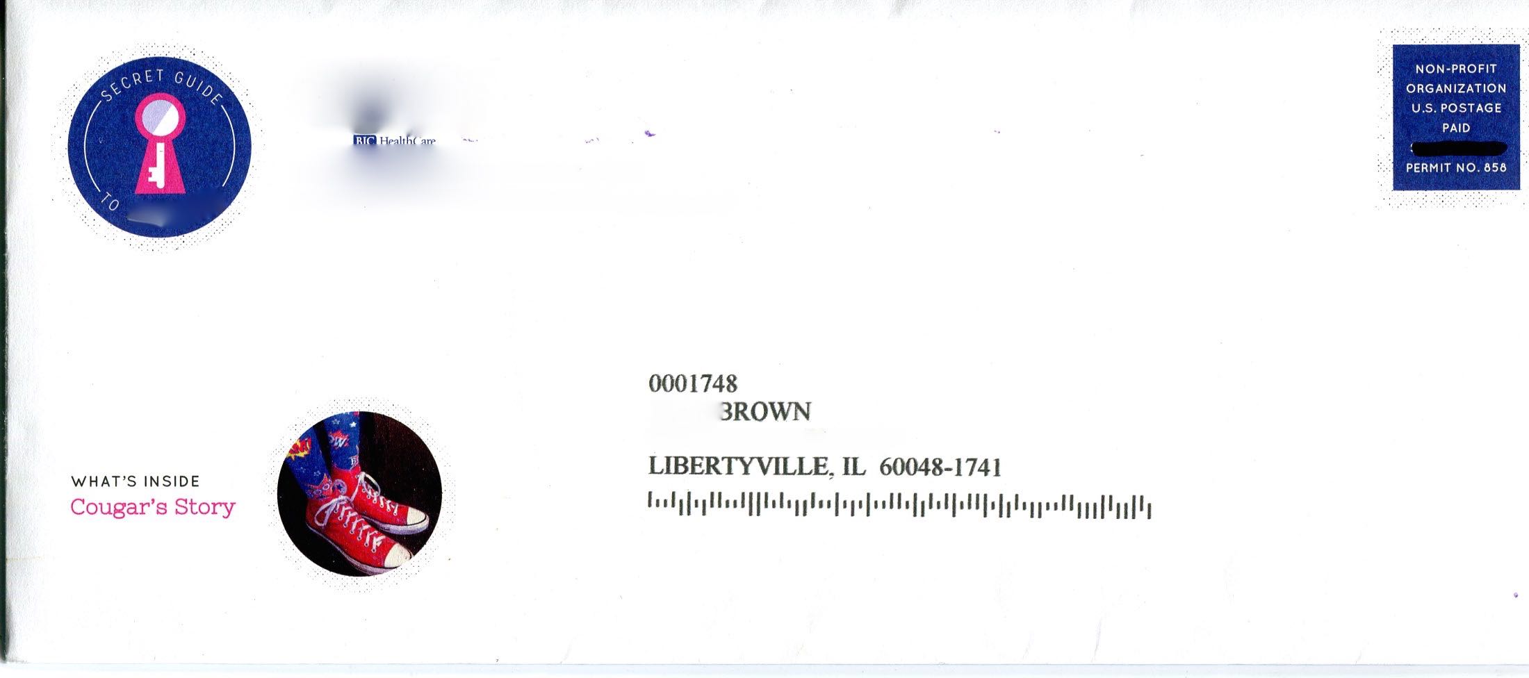
The hospital’s familiar happy logo is disguised here, but this envelope brings no bad news.
That is the case with this fundraising piece for a well known children’s hospital. For its sake, anonymity will prevail. But here is a 7-step rule book on designing fundraising mail.
1. Set the mood for urgent need.
A snappy colorful tease, but is it urgent?
To that end, use color and graphics sparingly, to best create a tone that delivers gravity, not levity. The envelope for this kit displays a cheery logo (disguised here) for the hospital. Understandably, it wants to convey happiness for its patients. But that’s not the right strategy for getting financial backing.
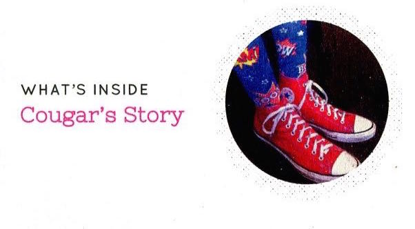
The OE features a spunky new pair of pink sneakers teasing the story of a cured patient, whose story is inside.
The “story inside” teaser is good. But the sneakers remind one of a Saturday morning kids TV show. Pretty, but not important.
2. Follow up with a personal request.
One of the most recognized personal media in existence is the letter. When we open an envelope, we are looking for it. The letter sets the agenda for the potential donor. This is who we are. Here’s our challenge, and how you can help.
There is a myth that people no longer read letters, and certainly not long ones. Not true! If your story is real, and the request is sincere, the letter will be read.

A potentially compelling story is delivered in challenging, small white type against a pink background.
Named, titled and signed, the letter provides basic credentials. A person is “at the other end of the mail box”.
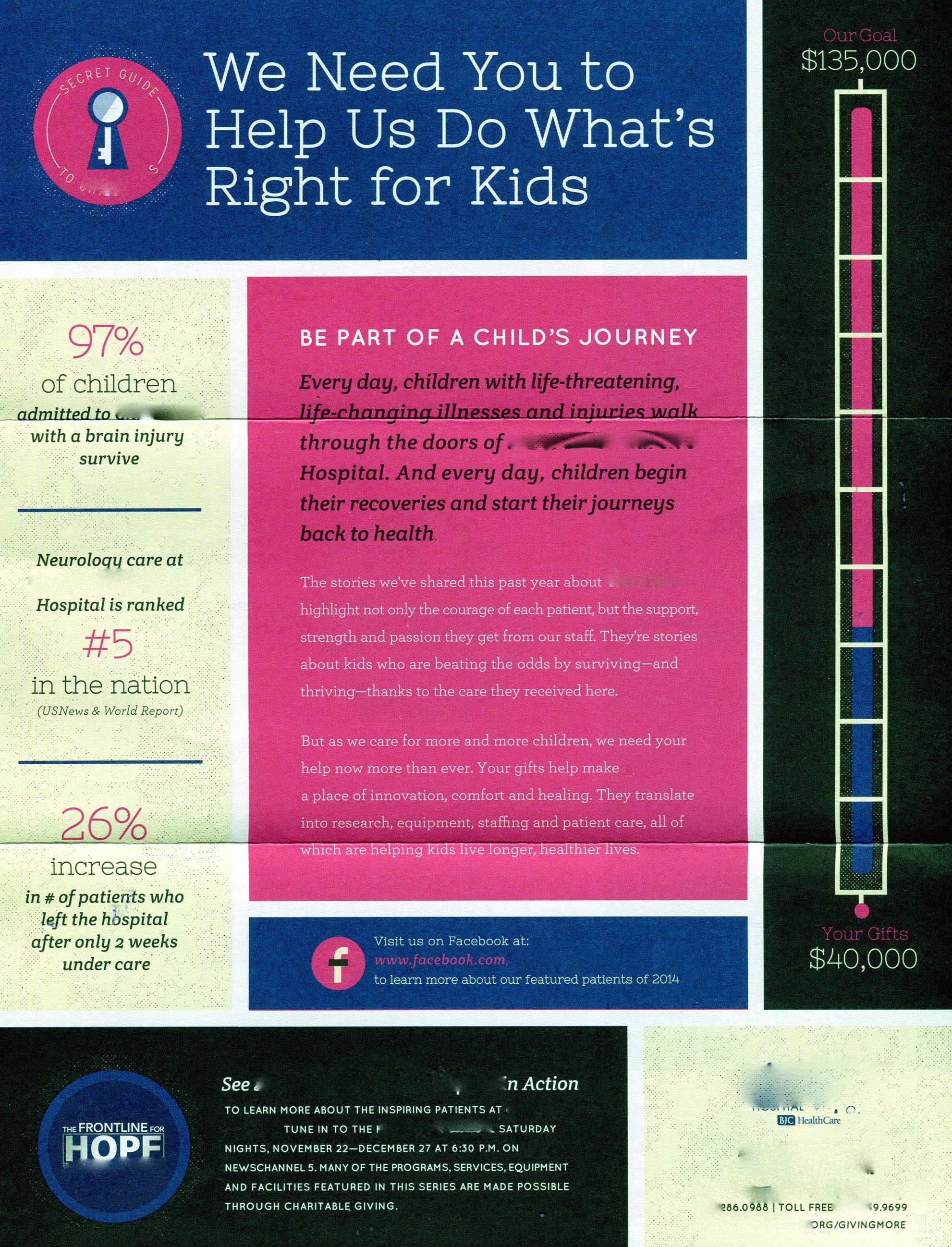
This piece has no letter, but rather hangs its success on a two-page high color sell sheet.
3. Demonstrate and prove the wise use of donations to solve the problem.
Convince the donor that money is needed, and that it won’t be wasted.
The hospital has a goal of $135,000. What for? It is not apparent that it is short of funds, or solely supported by charitable donations. Not knowing that, why would a donor be moved to give?

A logical effort to monetize the services provided. But what are the Circles all about?
To its credit, the hospital does explain what your money will buy. It also presents operating statistics, and some official endorsements.
To put an edge on the numbers, show how many cases were turned away or disadvantaged for lack of funds.
4. Be legible and understandable.
Possibly the most difficult task of a senior donor is to read copy that is too small, and reversed out. In this case, important “ask copy” and narrative is in 8-point type, white on pink. Pink on black. Blue on white. Ouch!

The significance of the “Secret Guide” is just that: secret.
This piece also employs some secret code, uninterpretable by the cold prospect. The use of their “key” logo is un-explained, and a series of icons on the pledge card do not telegraph any meaning to the uninitiated.
5. Tie the Ask To A Specific Need.
The story in the piece relates to a child’s full recovery after an accident. The pledge card, and supporting copy don’t connect to the child’s need, or to the next child with a similar accident.
The list of financial values and associated services in the ad piece refer to Circles of Commitment and generous benefactors, but the recognition value of the Circles is not explained.
6. Urgency.
Any mailing’s strategy is aimed to get a response immediately.  This fundraising piece needs some parameters to define the timely need for a donation. What will happen if they don’t reach $135,000? When will time run out?
7. Indispensability.
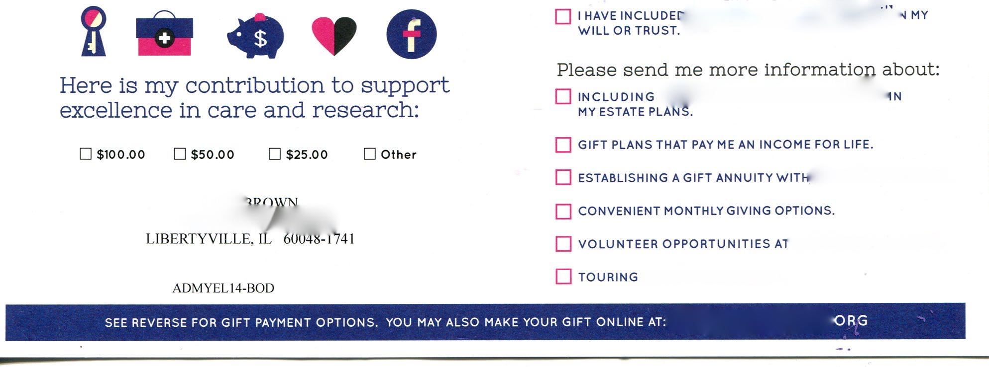
The mystery of the icons: how do they work?
The best direct mail is impossible to throw out. It just sits there on the kitchen table, or on the dresser until the responder finally acts. This piece lacks that important nagging factor.
A gift, a freemium, a stamp, a coin, a sample, a personalized card, a photograph, an address label set, are examples of items that are hard to ignore.
Unless the donor had already decided to contact the hospital, or the donor’s accountant recommended more charitable giving, there’s no reason to hang onto this piece.
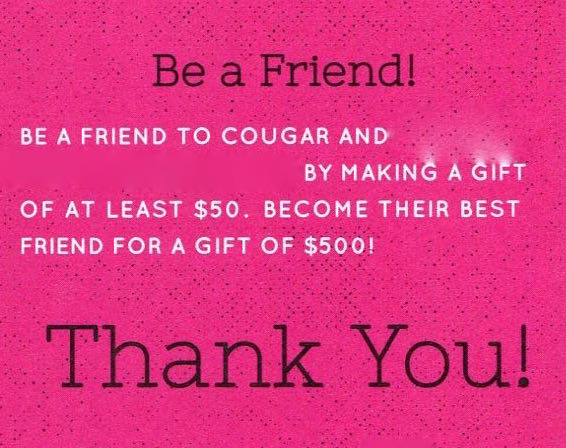
$50 bucks? We haven’t even met!
Direct mail design is challenging because the mailer gets bored with the “same-old, same-old”. There is a temptation to jazz up the piece just to be different. After all, you mail out a few thousand, or a few million, and they all look the same!
Just remember: the recipient only gets one piece, and to that person, the piece is well distinguished, just by its mere arrival.
Thanks for reading! If your fundraising program is serious, make it look that way. There’s nothing more serious than asking for money.
Discover more from Phil Brown
Subscribe to get the latest posts sent to your email.
