Culture, direct mail, Media, Science, Thank You, USPS

You Are Still On My List

A written card, delivered by mail. Old fashioned, and meaningful.

This morning, CBS Sunday Morning with Jane Pauly featured the story of a father in Valdosta, Georgia who has sent over 20,000 post cards to his kids since 1995. The kids have saved every one, and their bookshelves are packed with volumes of fatherly words to his children.

As a devout postal fan, I was intrigued and pleased that there was a fellow writer who still believed in sending cards and letters.  Indeed a while back I wrote about the beauty of the written thank you note.

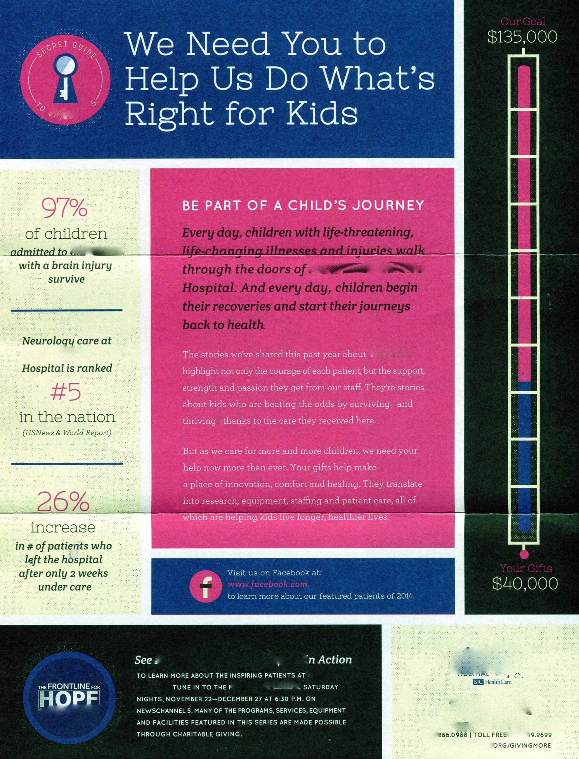
It drove me to look at the latest USPS Revenues Pieces and Weights report that measures the postal pulse of the nation. What I found was both disturbing, and a little puzzling.

Direct mail surrendered some market share to the web.

We know that mail volumes have conceded their dominance to email and online transactions. Even direct mail, which is a vibrant, robust medium has also given up share to the web.

But what was revealing about our culture are the declining totals of personal mail for the last three months, from October to December, 2017.

Simply put, we stopped writing.

Year over year, the Q4 volume of “single” letters slipped 5.9%. A blip? No, because single letters had dropped 5.1% the previous Q4 as well.  A single letter is typically a bill payment, a business letter, or a personal letter.  Or perhaps a greeting card.

The Greeting Card Association reports 7 billion cards are produced every year.

Percentages don’t really tell the story though. This past quarter, the single letter volume dropped 313,044,000 pieces.

To put that into terms we understand, I remind you that every Q4 we celebrate Halloween, Remembrance or Veterans Day, Thanksgiving, Christmas, and approximately 75,000,000 birthdays.

The USPS counter selection is not encyclopedic, but it is enough to trigger the impulse.

The Greeting Card Association reports that we purchase over 7 billion greeting cards every year.  And it turns out that the USPS delivered 17.5 billion single letters in 2017.   Maybe the remaining 10.5 billion single letters are just business and bill payments.  So, did we stop sending personal letters, or did we stop paying our bills?

The answer again pops up in the USPS reports.  In 2017, Presort First Class letters, aka, bulk business letters dropped over 5%: 787 million fewer bills and statements going out; fewer checks coming back.

It further develops, according to the USPS 2016 Householder Diary that Americans sent 3.6 billion letters “household to household”.

Conclusion: consumers are doing their business online, receiving and paying their bills electronically.

This is a huge relief to me, because it means that we are still writing personal cards and letters…I think.

For certain, the volume will never drop to zero, because of the persistent efforts of a father in Valdosta who still writes his kids every day.

How often do you?

Thanks for sharing!  If you would like to see the USPS reports for yourself, click here!

Standard
direct mail, Marketing

Pretty Ain’t Pretty Sometimes

Hospital 978

A 2-page high color sell sheet, but no letter!

When you are on the marketing end, you may feel that direct mail, especially fundraisers and business mail, looks pretty vanilla. Maybe even bland.

So the urge is to pretty it up.

Hospital 976

The hospital’s familiar happy logo is disguised here, but this envelope brings no bad news.

That is the case with this fundraising piece for a well known children’s hospital. For its sake, anonymity will prevail. But here is a 7-step rule book on designing fundraising mail.

1. Set the mood for urgent need.

Hospital Sneakers copy

A snappy colorful tease, but is it urgent?

To that end, use color and graphics sparingly, to best create a tone that delivers gravity, not levity.   The envelope for this kit displays a cheery logo (disguised here) for the hospital. Understandably, it wants to convey happiness for its patients.   But that’s not the right strategy for getting financial backing.

The OE features a spunky new pair of pink sneakers teasing the story of a cured patient, whose story is inside.

The “story inside” teaser is good. But the sneakers remind one of a Saturday morning kids TV show.  Pretty, but not important.

2. Follow up with a personal request.

One of the most recognized personal media in existence is the letter. When we open an envelope, we are looking for it. The letter sets the agenda for the potential donor. This is who we are.  Here’s our challenge, and how you can help.

There is a myth that people no longer read letters, and certainly not long ones.  Not true!  If your story is real, and the request is sincere, the letter will be read.

Hospital Cougar copy

A potentially compelling story is delivered in challenging, small white type against a pink background.

Named, titled and signed, the letter provides basic credentials. A person is “at the other end of the mail box”.

This piece has no letter, but rather hangs its success on a two-page high color sell sheet.

3. Demonstrate and prove the wise use of donations to solve the problem.

Convince the donor that money is needed, and that it won’t be wasted.

The hospital has a goal of $135,000. What for? It is not apparent that it is short of funds, or solely supported by charitable donations. Not knowing that, why would a donor be moved to give?

Hospital Circles copy

A logical effort to monetize the services provided. But what are the Circles all about?

To its credit, the hospital does explain what your money will buy. It also presents operating statistics, and some official endorsements.

To put an edge on the numbers, show how many cases were turned away or disadvantaged for lack of funds.

4. Be legible and understandable.

Possibly the most difficult task of a senior donor is to read copy that is too small, and reversed out.   In this case, important “ask copy” and narrative is in 8-point type, white on pink. Pink on black. Blue on white.  Ouch!

Hospital Key copy

The significance of the “Secret Guide” is just that: secret.

This piece also employs some secret code, uninterpretable by the cold prospect.   The use of their “key” logo is un-explained, and a series of icons on the pledge card do not telegraph any meaning to the uninitiated.

5.   Tie the Ask To A Specific Need.

The story in the piece relates to a child’s full recovery after an accident.  The pledge card, and supporting copy don’t connect to the child’s need, or to the next child with a similar accident.

The list of financial values and associated services in the ad piece refer to Circles of Commitment and generous benefactors, but the recognition value of the Circles is not explained.

6.   Urgency.  

Any mailing’s strategy is aimed to get a response immediately.   Hospital $135,000 copyThis fundraising piece needs  some parameters to define the timely need for a donation.   What will happen if they don’t reach $135,000?   When will time run out?

7.   Indispensability.

Hospital 980

The mystery of the icons: how do they work?


The best direct mail is impossible to throw out.   It just sits there on the kitchen table, or on the dresser until the responder finally acts.   This piece lacks that important nagging factor.

A gift, a freemium, a stamp, a coin, a sample, a personalized card, a photograph, an address label set, are examples of items that  are hard to ignore.

Unless the donor had already decided to contact the hospital, or the donor’s accountant recommended more charitable giving, there’s no reason to hang onto this piece.

Hospital $500

$50 bucks? We haven’t even met!

Direct mail design is challenging because the mailer gets bored with the “same-old, same-old”.  There is a temptation to jazz up the piece just to be different.   After all, you mail out a few thousand, or a few million, and they all look the same!

Just remember: the recipient only gets one piece, and to that person, the piece is well distinguished, just by its mere arrival.

Thanks for reading!  If your fundraising program is serious, make it look that way.  There’s nothing more serious than asking for money.

Standard
direct mail, Marketing

Presidential Letter-Writing: Good, Bad and You Know…

letter-writingA key principle of direct mail strategy is building the personal connection.   Traditional mail order mavens personalize a relationship with a letter from the president, or owner of the business.   When a customer buys, not only are they endorsing the product, but they are also connecting with the owner, who is implicitly guaranteeing satisfaction.

So when you are making the choice to use a letter or not, you are really deciding, “is this going to be personal, or just business?”   Put another way, is this admail, or direct mail?

Within the letter-signing world however, there are good and bad examples.

The best is the personally signed note.   Not economical, but surely convincing.

AAA HuffstetterThe least persuasive is the typeset signature.   Paranoiacally concerned a signature analyst is going to tear it apart.

But there is something far more worrying.

Perusing the news, I saw a photograph of the President’s signature on the Affordable Care Act.   Put aside the law’s contents, what was striking was the shaky signature.

obama signatureAs if our leader had pauses in memory, moments of hesitation, stopping half way through a letter, and then continuing the curve until the next stop.

You may already know this, but in case you have been a life-long libertarian ignoring all laws, and thus this quirky writing habit of CEOs, the jerky writing is attributed to using multiple pens to sign the official document.

In the case of the ACA, there were 22 pens.   See how healthcare costs add up so quickly?

But I digress.   I did a search on this multiple pen phenomenon, and up popped a Time Magazine article with the same signature incident, along with the headline suggesting that our President may have an undiagnosed case of OCD. 

See how a signature creates an image?

Obsessive-compulsive or not, one cannot mail a lot in a full 12-hour day with this type of pen-stutter.

Better, is the thoughtful touch of our third President, Thomas Jefferson.

Jefferson MachineRecognizing the power of automation, married seamlessly to manual control, he introduced the polygraph to the Department of State.   This contraption was invented in 1803 by John Isaac Hawkins, of Frankford,  Pennsylvania.

Using the polygraph Jefferson was able to create up to five letters with one sweep of the pen.

Did he know how important direct mail fundraising would become 200 years later?

Standard
direct mail, Marketing

Are You For Real?

SantaLetterText-776x1024“You have to write letters to get them,” said my 5th grade teacher as she drilled us on formatting.    What a drag.    At the uncomfortable age of 10 we had no one to write, let alone anything to say.

So it’s ironic that over half a century later I exit from a successful business which is all about writing good letters.

In direct mail, the letter is the backbone of building a personal relationship.  Avid consumers are enchanted by letters from their favorite gardener, doctor, hunter, dress maker, shopper, financier, teacher, traveller and coin buff  frothing over the latest gadget, find, or technique.

It’s no wonder direct mail grew astronomically through the back half of last century and into this one.    We were guaranteed to receive a letter at least once or twice a week with important news from somebody we knew, and who knew us, from far away, like Terre Haute, Fort Wayne, Franklin Center, Troy, West Babylon or Battle Creek.

But the bloom pales, if it doesn’t fall right off the rose if we discover that the writer doesn’t exist.    I was stunned when I learned that Readers Digest’s Carolyn Davis was just a beautification project — a makeover from “CD” for the Credit Department.

Betty Crocker in the Witness Protection Program

Betty Crocker in the Witness Protection Program

Carolyn was just my first commercial heartbreak.    I only recently learned that Betty Crocker, the lady who guided my mother through countless birthday cakes and blueberry muffins is a complete phony.   Never existed.    Isn’t even an anagram for an NSA operative named Cory Berckett… clandestinely stealing philo recipes while posing as a dishwasher.

Martha Logan modeled on Beth Bailey McLean

Martha Logan modeled on Beth Bailey McLean

The charade continues.   Martha Logan, who managed the Swift meat kitchen for a generation never existed, though at least she was a pen name for the real Beth Bailey McLean.

Ms. McLean was born in Superior Wisconsin in 1892 and knew her bacon.   But Swift’s ad agency apparently wasn’t satisfied with her creds.  They invented their own version of Martha Logan to broadcast from the Swift radio studios on Chicago’s WLS.

The Radio Martha Logan

The Radio Martha Logan

This new Martha had a photo portrait, and was reared and educated in Illinois, homeland of a long tradition of phonies.

Still, there’s one more fictional character, Beatrice Cooke.

Beatrice Cooke, queen of cream.

Beatrice Cooke, queen of cream.

She was the majordomo for Beatrice Foods, formerly the Beatrice Creamery Company, founded in 1894 in no, don’t say it, Beatrice, Nebraska.  That’s right, there never was a whiff of a Beatrice in that company unless she was lactating in a stable outside.   Adding the final insult, Beatrice moved to Iowa in 1905.

Which brings me to a quandary today.   On impulse, I made a donation to Wikipedia.   Totally guilt-ridden, I felt better after giving them a measly $10.    In response, I received a Thank You letter from Sue Gardner, executive director of Wikimedia Foundation.

Well, this wasn’t a Thank You letter.   It was a THANK YOU letter.  555 words, 14 paragraphs, 49 lines and 3337 keystrokes.   I winced in embarrassment.   Imagine dropping a few pennies into the Salvation Army bucket, and the bell ringer chases you down the crowded street crying thanks, before tackling you around the knees and blubbering all over your $900 cashmere wool coat.

scroogeMs. Gardner saw my paltry $10 funding the sum total of all world knowledge sought by countless individuals, and she began to describe the dire circumstances of each of them.

She concluded: “On behalf of the Wikimedia Foundation and the half-a-billion other Wikipedia readers around the world: thank you.”   

This was a “loaves and fishes” moment.   I did not guess my $10 would go that far.

Truly though, her letter did its job.   I have to return to Wikipedia, and I will no doubt double down on my charity.

But now I wonder– is she really there?

https://donate.wikimedia.org

Standard