direct mail, Marketing

The Roots of Customer Loyalty

Version 5

A 100-year-old brand backed by its owner.

We all have brand imprints that are part of our core. Coke, Kellogg, General Electric, Disney — these are trusted, bedrock brands we’ve known since birth.  The most valuable brands today would be Apple, Google, Facebook–but not necessarily the most trusted, yet.

Then, there are those brands which court obscurity.  Names like Zenith, Woolworths, IGA, Rexall…all in their time were once powerhouses.

haband-252-1

A conventional envelope kit with 50 inserts, weighing in at only 3.2 ounces… a postal bargain.

So how is it that a company called Haband has 5,000,000 customers?

I wondered this puzzle when I received their mailing last week.  Haband is a mailorder merchandiser founded in 1915 by two gentlemen: M. Habernickel and John Anderson.  They sold ties to bankers in Manhattan.

Talk about product selection! Who wears ties today?

haband-262

Clothing and footwear replace the original Haband product line: neck ties for bankers.

From their early beginnings the Haband brand grew to offer general merchandise, mostly, but not limited to, clothing.

Their style choices are not for everyone, and you would be right to suggest that your parents and grand parents would be more likely targets.  Put another way, getting a Haband mailing is like getting an AARP mailing, only much later.

The secret to Haband’s success is the core… the essence of direct mail.  A champion writes a letter to a customer, providing personal assurance about the desirability of a product.

Version 4

The letter is central to the offer, and in this case, Duke’s guarantee of satisfaction.

Duke Habernickel is, I am guessing, the son or grandson of the fabled company’s co-founder.

The products in question range from duck boots to space heaters, from fleece pants to “ForeverSharp” razors.  The broad selection is what I might have found in my late parents’ closets when we moved them into more modest and permanent surroundings.

haband-258

Free gifts: knife, watch and pen. Suitable for any Haband customer!

But when it comes to direct marketing, what sells, and what doesn’t sell is more than personal taste.  I have learned that my opinion does not count.

This is a platinum rule, maybe even titanium.  Put another way, just because I wouldn’t buy it doesn’t mean that no one else will buy it.

Au contraire!

Haband is successful because it knows its customer very well, and the customer has a reciprocal expectation and trust in Haband.  Thus, Duke Habernickel signs his name to a letter introducing no less than 46 items for purchase, plus another 3 free gift items to sweeten the deal.

The Haband mailing piece is itself unusual in today’s environment.   With so many products you may have expected a catalog.

Instead, it is a low-color, 6 x 10 envelope stuffed with 47 individual sell sheets, plus letter and reply envelope.

haband-264

The kit delivers 47 product sell sheets, from shoes to sharpeners.

The two-sided, 4-color sell sheets each contain the entire deal, embroidered with enthusiastic sell copy, and anchored with individual order form.  They are printed on the lightest coated paper stock available.

While you may question the flimsy medium, Haband gets the 47-piece job done in just under 3.3 ounces, thereby capturing the lowest possible postage rate.  By the square inch, each product has a digest-sized page of display.  Pretty smart.

Duke’s letter is verbose, jumbled, effervescent, and personable.  It is traditional, and lacks the slickness of general agency creative.  The copy is laced with 28 “you’s and your’s” in addition to 8 personal references by name.  More significant however are 7 “me’s, I’s and my’s” illustrating Duke Habernickel’s personal investment in the relationship.

Version 2

It would be a challenge for many marketers to claim being “your friend”, but that’s what counts for Haband customers.

For some, the effect may be unctuous, but if you are a Haband customer, you are Duke’s customer, and comfortable with it.  The personal touch is expected and welcomed.

The roots of customer loyalty are founded in matching customer expectations, tone and manner.  Whoever, and wherever those 5,000,000 buyers may be, they will not be discounted as strangers at Haband.


Thanks for reading! I believe this is the first Haband piece I have ever received.  I must ask serious questions about what demographic group I have now joined.


Standard
direct mail, Marketing

Walgreens Rolls Up Your Sleeve

Walgreens 227

This may be the best traffic builder ever.

This week we received a notice from Walgreens (at the corner of happy and healthy). It’s only August, but they are now targeting my left arm for a flu shot.

This is the painless inoculation that fends off the swarms of flu virus planned to put me in bed next February.

What is not painless, and what Walgreens has figured out, is the paperwork. The mailer includes the consent form that normally we fill out at the scene.

The pocket encloses the nefarious consent form we normally fill out beside the ointments display.

The pocket encloses the nefarious consent form we normally fill out beside the ointments display.

Kudos to the marketer at this famed drug chain who saw the chance to streamline the process, save a few minutes, boost traffic, and promote sales all at the same time.

Truly, the flu shot appointment is drudgery. Who wants to sit behind a curtain in a tiny corner getting stabbed? Who wants to fill out a two-sided form on a clip board, standing beside the first aid display?

Walgreens provides the form, by mail. Bring it in, and –poink– you’re ready for the needle. The only question to answer, “Which arm?”

This annual campaign is one of the easiest to master, and I am surprised more drug chains don’t use it. Selecting a list targeted at seniors is easier than falling asleep in front of the TV.

The creation of the package is simple: envelope and form. In this case, the programmers could have stepped up, and matched our street address to the closest Walgreens store, included its address and a map, but they didn’t.

Walgreens 230 (1)

The consent form is personalized. Walgreens could have included store# and address without much fuss.

They could have also matched our rewards account and popped a little note in the kit to personalize the event, but bedside manners may not be first and foremost in their minds.

Costwise, the investment is 45 cents a piece. With a response rate of 30%, the cost per visit is $1.50 ($0.45/30% = $1.50). Given that most retail traffic builders pull far less response, and usually offer discounts on top of that, this promotion is a winner hands down.

Walgreens gets the flushot revenue from Medicare, plus an in-person visit from a retail customer.

Walgreens 233 copy

Surprisingly, the incentive is buried here: a $2,000,000 donation to the U.N., and an important deadline. Shoulda-woulda-coulda!

Passing The Zig Ziglar Test
This is a moment to validate the Walgreens mailer according to the late sales counsellor Zig Ziglar’s test for sales viability.

He posited, quite astutely, that there were five road blocks to making a sale. The Walgreens promotion knocks down each of these objections:

1. No Need– The target list is to 65-year-olds, prime flu victims
2. No Desire– Walgreens streamlines the paperwork, and further offers a donation to the United Nations Foundation for every inoculation
3. No Money– Virtually free: costs are covered by Medicare and most health insurance
4. No Rush– The offer does have a deadline for eligible donations, but Walgreens could have pushed this harder. See the fine print.
5. No Trust– Hey, this Walgreens–America’s favorite drug store!

Overall, with a few tweaks, a great, timely promotion.

I’ll look for the bottom line next February.

Standard
direct mail, Marketing

PCH and The Hard Truth About Pressure Sensitive

Yesterday we bought a sheet of stamps at our post office, and the smiling attendant cautioned me, “Those should only go on envelopes!”

“Sure..like I might put them on the fridge maybe?”

He responded, “Exactly. A lady came in last week complaining she bought set of stamps, and when she couldn’t find them, said they had all ended up on the bathroom mirror.”

Clear evidence of a youngster in the house.

That is the happy truth of stickers. “Pressure sensitive” if you are in the business.   We love to peel them and stick them.

IMG_6043

Stickers!

A few years ago at a “Bring Your Kid To Work” class we took great enjoyment in explaining how direct mail packaging worked. I gave a swarming group of ten-somethings a bunch of fundraising mail.

“Open it up, and look for the stickers, guys!”

While I was fumbling through the kit, I dropped the contents on the floor under the table. Down I went after them. After picking the pieces up, I re-emerged from below to find that every smiling face in the room was covered in address labels and Post-its.

Is there anything more attractive in paper than glue?

PCH 2016-07 205 copy

The shiny poly label attracts the eyes, and the fingers, just to touch…

Just for starters, the direct mail kit that succeeds is the one with the best offer, hands down.  The trick is getting you to see, read and adsorb that offer before the envelope hits the can.  Stickers are the slippery slope to cognition in direct mail.

Publishers Clearinghouse masters the technique, and here’s how they have excelled at the game.

PCH 2016-07 211

This laminated sheet has two labels which must be peeled and placed on the order form.

Last week we received PCH’s latest deal, a 6 x 10 envelope announcing $5,000 a week for life to a lucky winner.  Can you believe that?

Actually, yes.  A 3% annuity on $6 million will do it, and PCH’s line up of advertisers will support that.

PCH 2016-07 206 copy

A stark wake up call: blunt and unapologetic.

The format lessons of PCH are worthy of attention though.  Their outer envelope sports a permanent, shiny poly label alerting a likely agent at the lettershop where to place it.   The label also alerts me that I am on the winner selection list.

I know, I know, me and 10 million of my demographic peers.  But still, we believe what we want to believe and we hear what we want to hear.

The point is, the label adds zero value to the offer, but its glossiness rivets my greed gene.   So I have to give pause for the $5,000 weekly stipend’s impact to sink in on my heretofore ascetic life.

PCH 2016-07 208

The official document, suitable for framing.

On the back of the envelope is a long forgotten typeface that graced impact printers thirty years ago.  8-pt. type, sans serif, calling me out.  Two phrases bring a momentary, primal galvanic response to my system: “you have ignored” and “your number will be dropped”.

The former kinda sounds like a warning, a scolding.  The latter, sounds bad, like maybe, I am going to be fired.  Yikes!

About now you may be thinking of PCH’s checkered past and all those dubious sweepstakes hypes they thrust on your grandad.  Let it pass.  That PCH came to heel back in the year 2000, and paid their debt to society.   Chastened, they pay homage to the rules.

PCH 2016-07 212

Not as impactful as a biohazard warning label, but reminiscent.

The second point of all that is that the PCH writers know how to wake us up.  Just a couple phrases, and I am motivated.   I open the kit.

Inside is a lot of paper.   Lots of brochures with lots of merchandise, including magazines.   Remember magazines?   Of course you do, and alongside those are some of the most fascinating merchandise items that only last week you saw on cable TV.

PCH 2016-07 213

The meat of the matter: this jumble of brochures is the workhorse in the kit.

Point three: there is an uninformed voice out there that believes neatness and brevity is the soul of direct mail design.  This voice belongs to millennials and general ad agency creatives.   Good direct mail that works leans toward messy, and hodge podge.  That’s why it’s called what it’s called.   But it works.

The key working tools in this kit however are just being revealed amid the clutter: a scratch off game, and even better, a bingo game with stickers.

PCH 2016-07 219

There was no doubt the bingo would be a winner, but the labels beg to be placed, regardless.

Would you be surprised to learn that the scratch off game turns out to work in your favor?  The numbers revealed all match…YES!!   And the bingo card, well, those numbers come together after nine squares are covered.  WOW!!

You wouldn’t be surprised, because you knew they were going to.   So did I but I patiently stuck them all on the card anyway.  Why?  Remember the bathroom mirror story?

Point four:  where the fingers go, the mind follows.   While the skeptic may say we are too mature to play with stickers, PCH knows that under those layers of our supposed adulthood meanders the brain of a K-1 which just couldn’t leave them alone.  That’s the hard and happy truth.

PCH 2016-07 220

The scratch game is a winner. How can we lose?

Digging into the package we retrieve the order form which really looks like the chalk-lined floor of a triple murder.   There are three hash-lined empty boxes waiting for you to supply the appropriate bodies, in this case…..stickers!

These shapes need attention, just like the kid’s patterned quiz, game and color place settings at Boston Pizza.  Digging into the pile of paper I find a laminated piece that includes another label that needs to be popped out and stuck onto the order form.

PCH 2016-07 222

The intuitive order form waiting for stickers, dutifully placed by yours truly.

Having completed two of the three boxes, I now go back to the kit to find two small stickers that I need to complete my form.   Flipping through the kit I see that all of the merchandise can be mine if I tear off the coded stamps, and place them on the form.

I go for the 75-foot pocket hose, and a half pound of Lincoln Wheat Pennies.

Point five: good mail order forms are the picture of good mental ergonomics.   There is a feng shui about form design that must be respected.  They are completely intuitive, much in the same vein as a brand new Mac computer which provides zero instructions.   The PCH form is beautifully designed, almost virginal, waiting for completion. It  avoids the messy hodge podge noted above.

(Incidentally, we buried a Mason jar of pennies out behind the bath house at our cottage years ago.   When we sold the cottage we spent a day feverishly digging holes to retrieve the jar but never found it.)

PCH 2016-07 216

There’s something for everyone. Admit it: the frying pan is a winner, and you want it.

The rest of the kit is a workhorse, selling its wares, notably the non-stick frying pan you can scramble an egg on with a power saw and not leave a scratch.  I should point out that there is also a letter enclosed, signed by a real person.

The sixth point  that you must recognize is that despite the massive publicity and coverage that preceded this package, PCH is not too big to ignore the value of the letter.  You shouldn’t either.   Letters are in our cultural DNA.  We like to read mail, and we like to be saluted by real, living people, and sometimes your letter is what wins a recipient over.

PCH 2016-07 223

The carefully inserted form must display your number. Do NOT mess this up!

After completing the form, the reply envelope awaits, and it too gives the buyer a dexterity test, both with a tear-off flap, as well as a die-cut hole designed to reveal what may be, possibly, remotely, prayerfully, your winning number.   No promises, but it would be foolhardy not to insert your order form in the proper manner.

Finally, the last sticker required brings us back to the beginning.

You will need a stamp.


Thanks for reading!   If you think PCH is wasting its time and money with all the paper, games and labels, take note that they run this promotion frequently.    It works.


Standard
Culture, direct mail, USPS

Tremors At The Post Office

Spoiler Alert: Numbers That May Surprise You!

The latest USPS report on mail volumes is out, and magically, incredibly, it points up.    The number-laiden Revenue Pieces and Weights report January 1- March 31, 2016 tells us volume for the past quarter was up 1.4%.

Big Business

For many of you, the news is lame. After all, what is an additional 520,183,000 pieces of mail? Actually, it turns out to be 37,414 tons, the equivalent weight of 454 Space Shuttles.  Which again points to the enormity of the US Postal Service.

Critics tend to discount the post office for its supposed obsolescence, but if you hang around a mail sorting facility for a moment, you know this is BIG, massive business.

So I for one am excited that mail volumes grew this past winter.


Slide2

Direct Mail and First Class Up

The better question may be why are they up?   It turns out that Direct Mail increased 1.9% over the same quarter a year ago, 355,488,000 pieces.   That could be related to political fundraising mail, and a cautious optimism in the economy.

First Class mail increased by 0.8%, 135,253,000 pieces.   An astounding turnaround!  Mind you, that includes all business mail.  When it comes to individually stamped mail, like birthday cards, bill paying and charitable donations, it was down 2%.  There is more intriguing news on this personal category in a moment though.

The big winner is Parcels and Packages which are exploding, correction, booming, sorry, mushrooming 13.2%.   This past quarter the USPS delivered 1,121,723,000 parcels, total weight: over 1 million tons.

The Magazine Subscriber Fails To Renew

What the report also reveals is the continued slide of Periodical volume: magazine counts dropped by 5.6%– 81,070,000 pieces over the three months compared to 2015.   Magazine subscriptions continue their slide.

The eye opener in this display of numbers is how mail looked just five years ago.   In 2011, total mail count for the quarter was over 41 billion pieces.   Since then volumes have dropped 6.7%, about 3 billion pieces.

While this is a generally understandable result of internet and social media, it is worthy of note that direct mail dropped only 3.4%, thus illustrating its successful economics.   By comparison, First Class Mail dropped nearly 13% in the same period.  Magazines, down 22%.

Parcels On The Move

You have to hand it to USPS management for the growth in Parcels.   While the internet may have crushed letter mail volumes, it opened the door for USPS package delivery.

Slide3

In 2011, Q2 Parcels totaled 667 million pieces.  This past quarter, USPS delivered 1.1 billion parcels, up a whopping 68% over five years.  And revenues? $3.7 Billion, up 82% from 2011.  The more we buy online, the more the post office delivers.

The significance of Parcels growth is that these numbers represent the USPS position in a competitive market with peers like UPS and Fedex.

Is Internet Migration Finished?

The encouraging story about Stamped Letters is worth a peek.   Personal letter volume cratered in 2008 and 2009 by -17.2%, and in 2010 by another -16.3%.    Since then, like a plane pulling out of a disastrous dive, Stamped Letters have nearly leveled out this past quarter at only a -2% decline.


Slide1

This leads one to believe that the attrition of postal mail to email and social media has just about finished.

Next month marks the end of another quarter for USPS record keeping. It will be interesting to see how the impact of the recent 1-2 penny decrease in price might improve mail volumes.

The direct marketers will take note, and who knows, maybe someone will pick up their pen and write one or two more letters as well.

Here’s the report for you review.  Enjoy!

Standard
direct mail, Fundraising, Marketing, Media

Battles In The Mailbox

IMG_5172

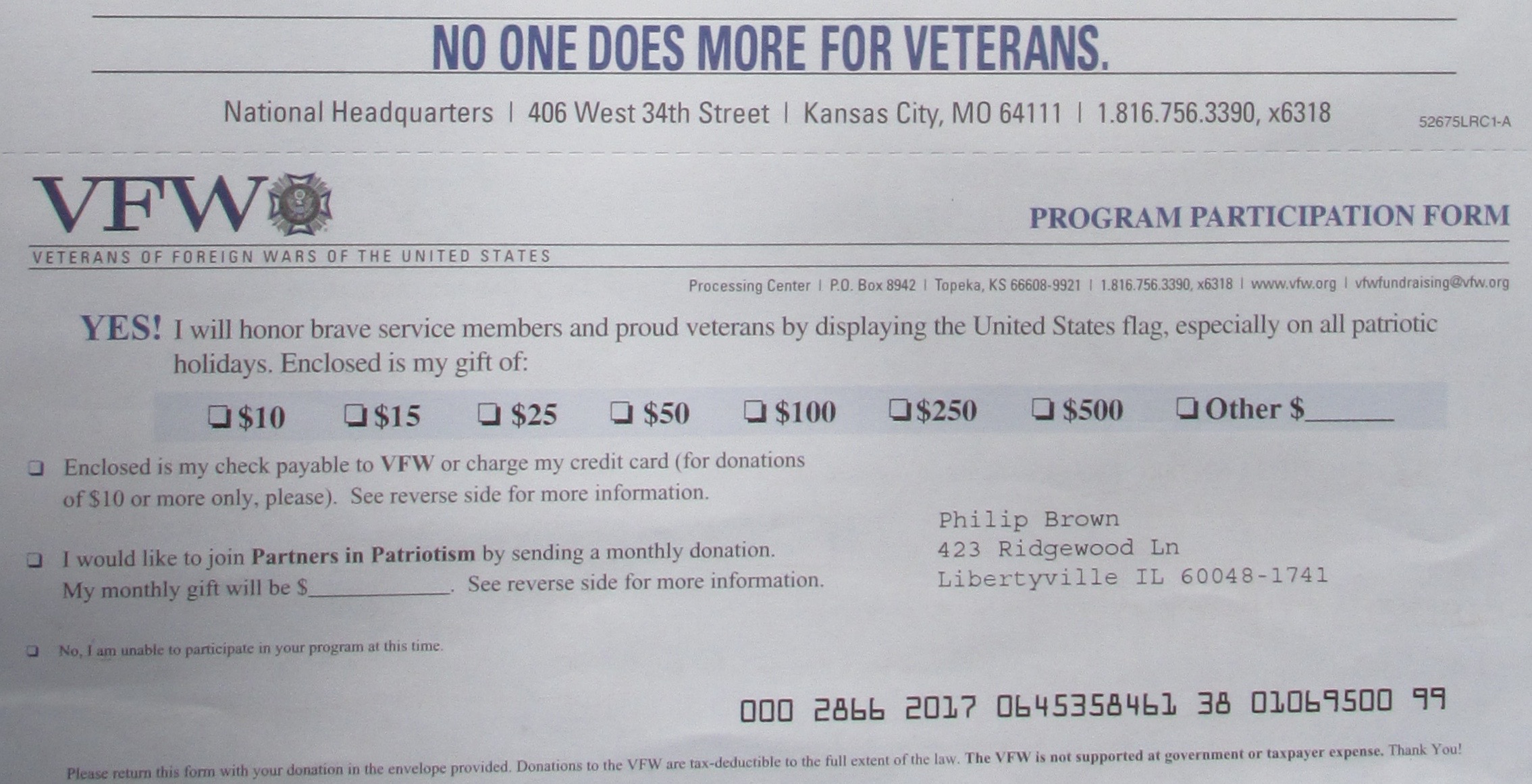
The Memorial Day rush begins.

There is an ongoing, armed conquest being waged in our mailbox.

Whether it was my donation to a certain political party that flagged my name, or perhaps a popular consumer magazine subscription, the ensuing barrage of fundraising mail from veterans’ associations is non-stop in our mailbox.

Regardless, the creative pitches are stunners, and deserve a closer look.  You are hereby invited to read my mail!

Most of these charities are profiled and rated on Charity Navigator.org, which strips away the emotion to detail actual performance against their stated missions.

Turnkey Office 

IMG_5163

As big as a door mat, and packed, too.

The Disabled Veterans National Foundation takes overwhelming force to a new level with their glossy, Flat-sized embossed package.  Despite the red-stenciled “DO NOT FOLD” our faithful USPS carrier did just that to get it in the mailbox.   It measures 12 x 15, and according to the weigh scales at our grocer’s fish counter, weighs 13.4 ounces.  If that seems heavy to you, perhaps we have been paying too much for our halibut.

IMG_5169

The field ready office with solar powered personalized calculator and stationery.

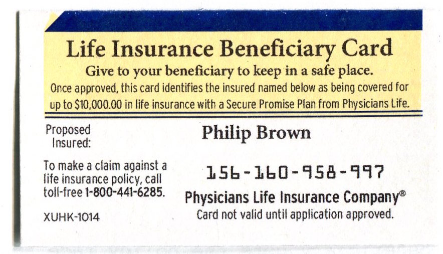
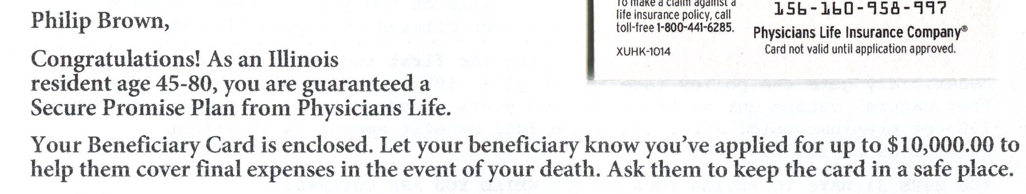
Inside this doormat-sized kit is a desk pad, calculator, calendar book and ball point pen.  Along with this prefab office kit is a $2.50 check drawn on a Bank of America account.   Surely a mistake, it is signed, dated and made out to me.   In the enclosed letter, the writer, smitten with remorse, asks me to return the check.

Check mailings are iffy because in many cases the marketer needs to have funds held in escrow to honor the checks if, fates forbid, the recipients decide to take the money.

Disabled Vets FNDN182

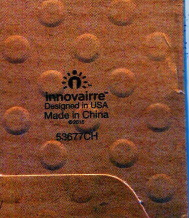
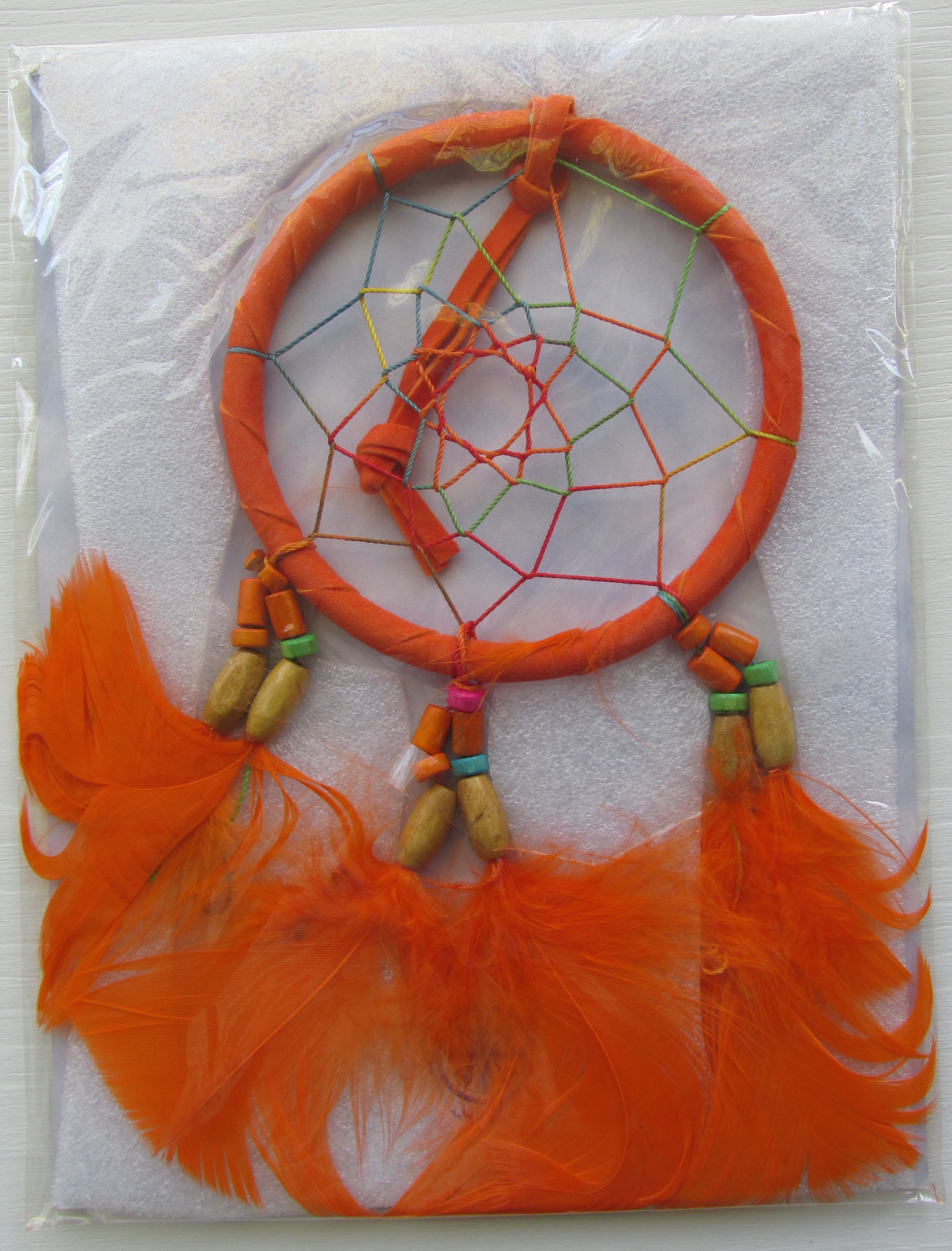
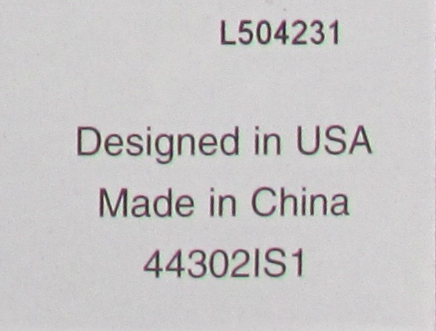
“Made in China”–The disturbing bug that must be shown.

This kit ain’t cheap.   Postage alone is nearly a dollar, and considering the hand-applied “Philip Brown” label on the calculator, plus its die-cut and tensor-ribboned place mat, the overall cost has to be at least $4-$5 dollars each.

Which may explain why the kit was made in China– not an encouraging signal for U.S Veterans.  I wait to see if they will send me a typewriter next year.
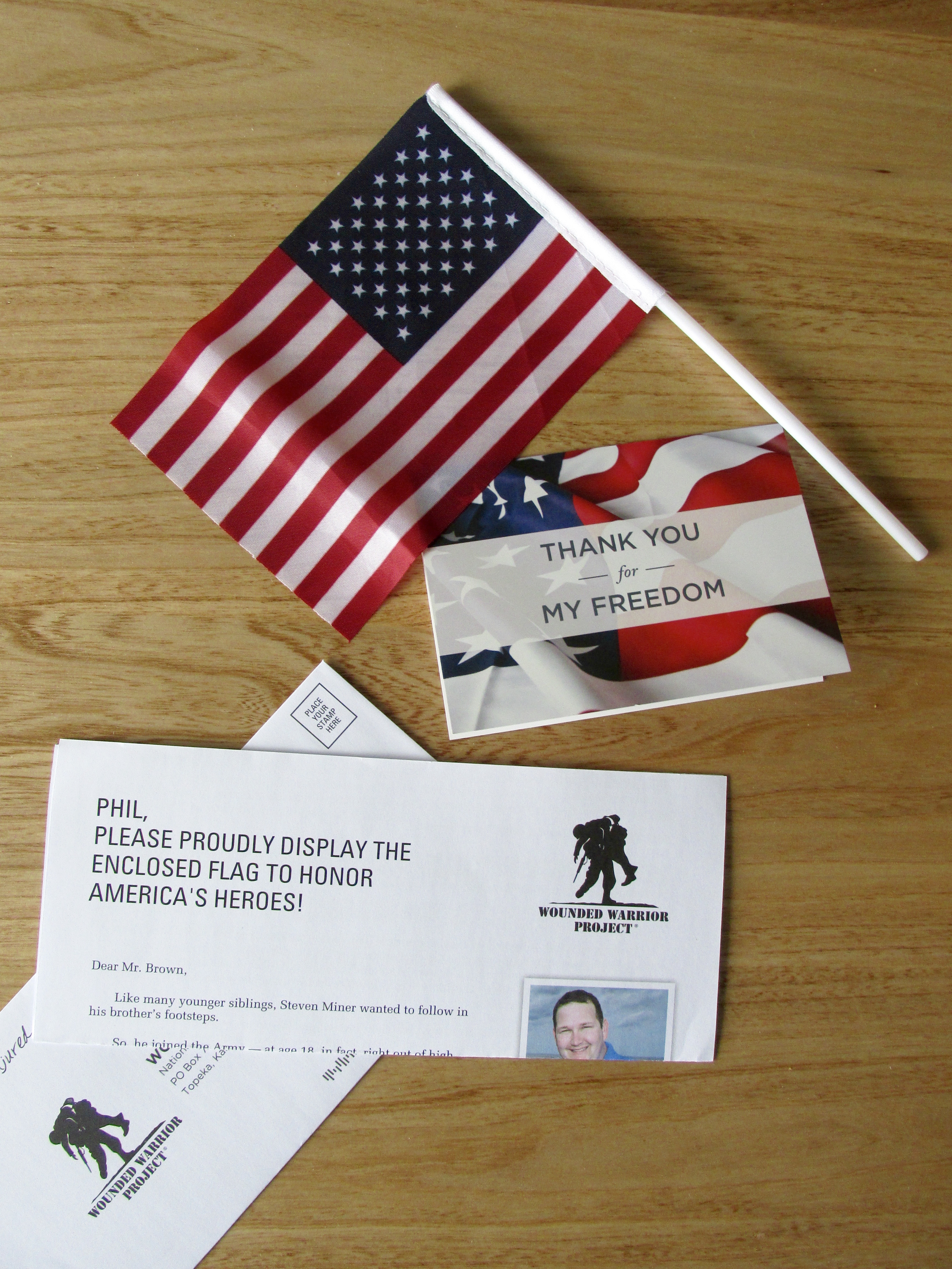
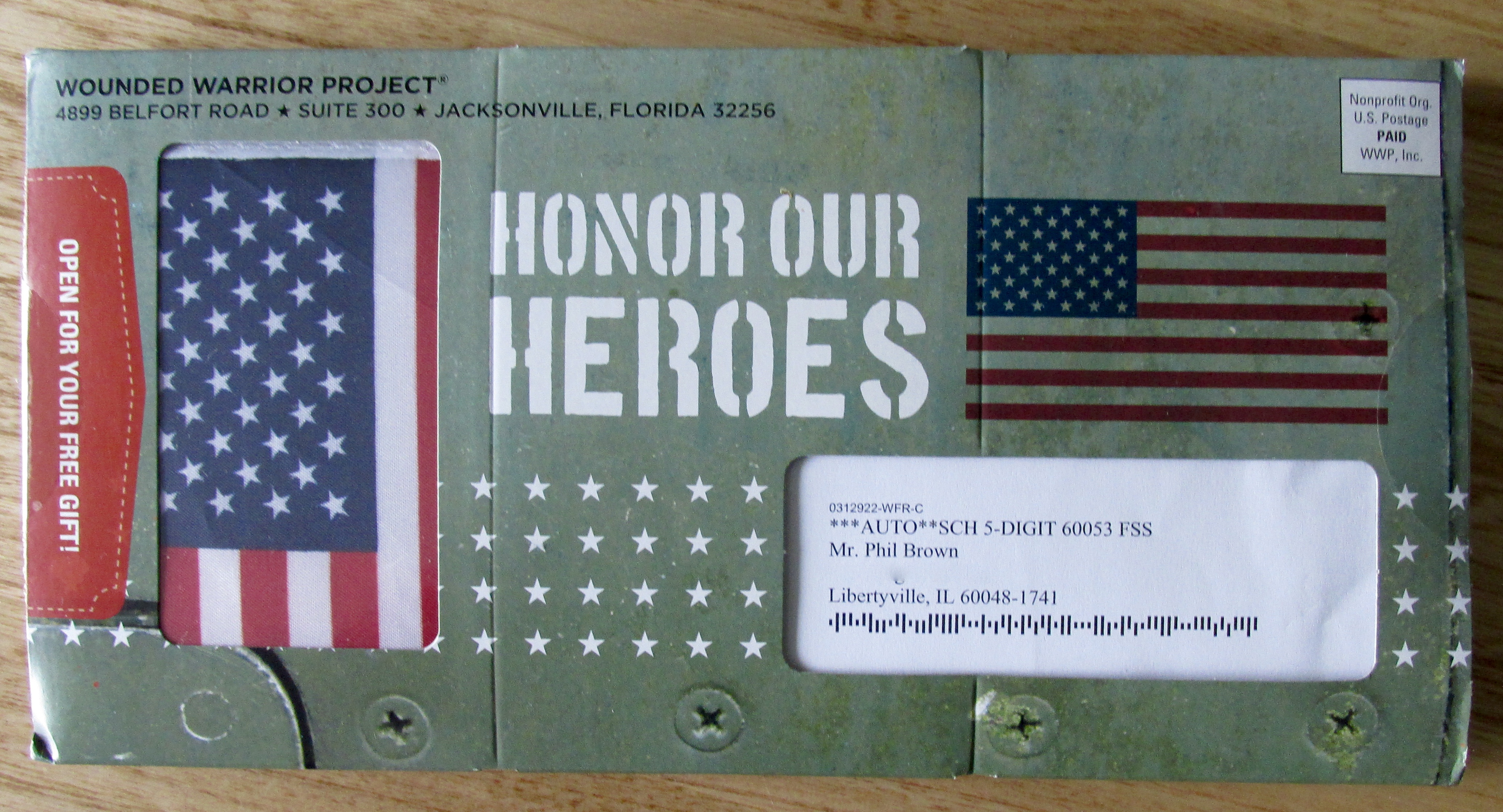
Parade-Ready Flag

IMG_5170

Steel plate reveal: your own desk ready Stars & Stripes.

Wounded Warrior Project also approached us with a package, a 5 x 10 windowed boxlet   displaying a real flag inside.  This Army-green imitation steel-plated ammo box is nearly half an inch thick, so it’s non-automation all the way..40-45 cents to mail.   The flag is intricately folded into a die-cut foam holder that also holds the addressed donor form, a hand-assembled product for sure… which explains again, why it was made in China.   In the mail, $1-$1.50 each.

We’ll talk about cost/response in a minute.
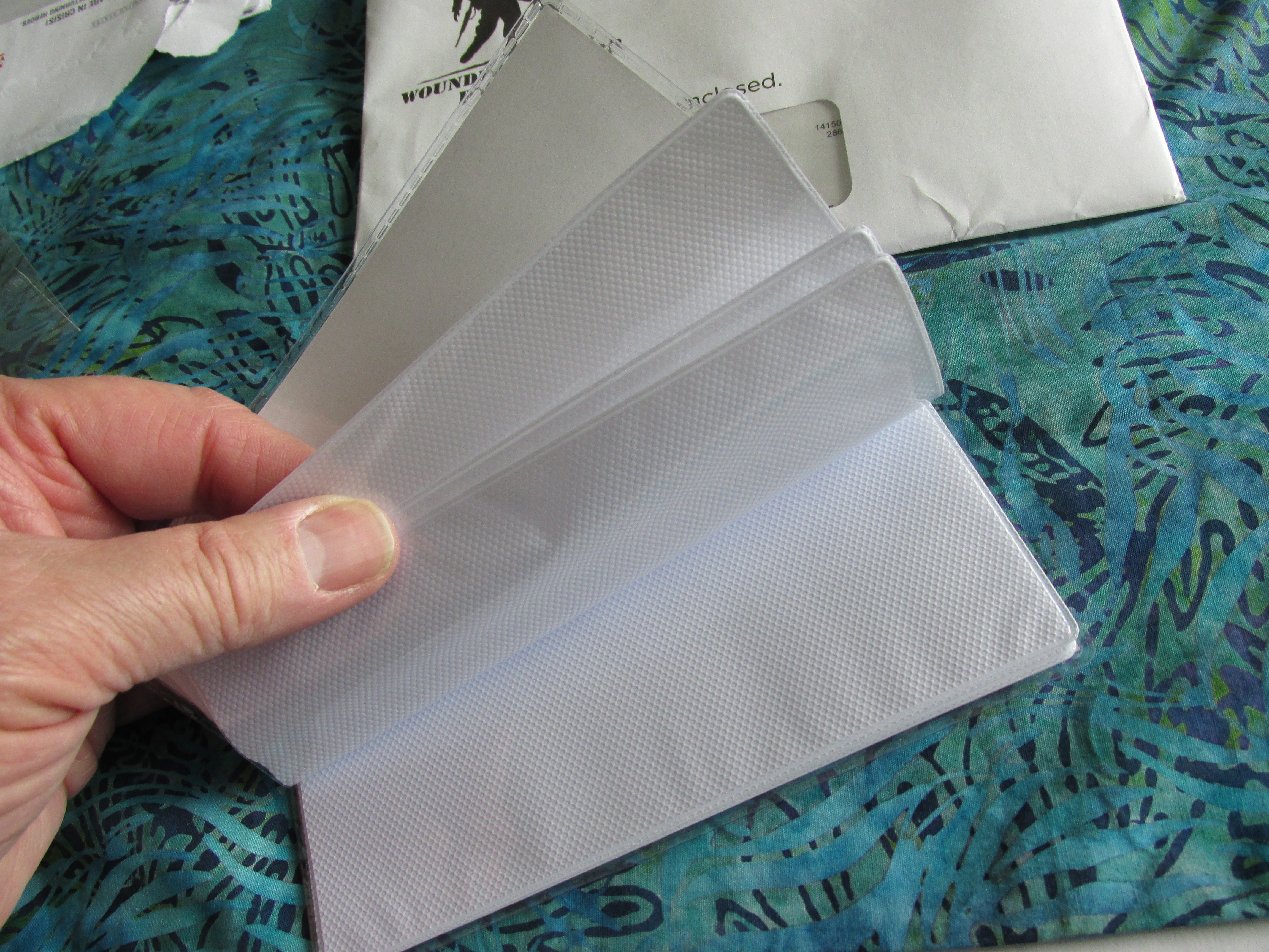
Photo Wallet

IMG_5187

A photo wallet… a hard to discard gift.

Wounded Warrior Project also sent along a separate request which included a 4×6, 20-page photo wallet.   Inside a regular 6 x 9 envelope, this gift actually made immediate sense, and the wallet now holds images of our ridiculously  brilliant, and beautiful grandchildren.  Not being one to take anything for granted, we will reward WWP for the effort.  Still, with postage, in-the-mail cost is 40-50 cents each.
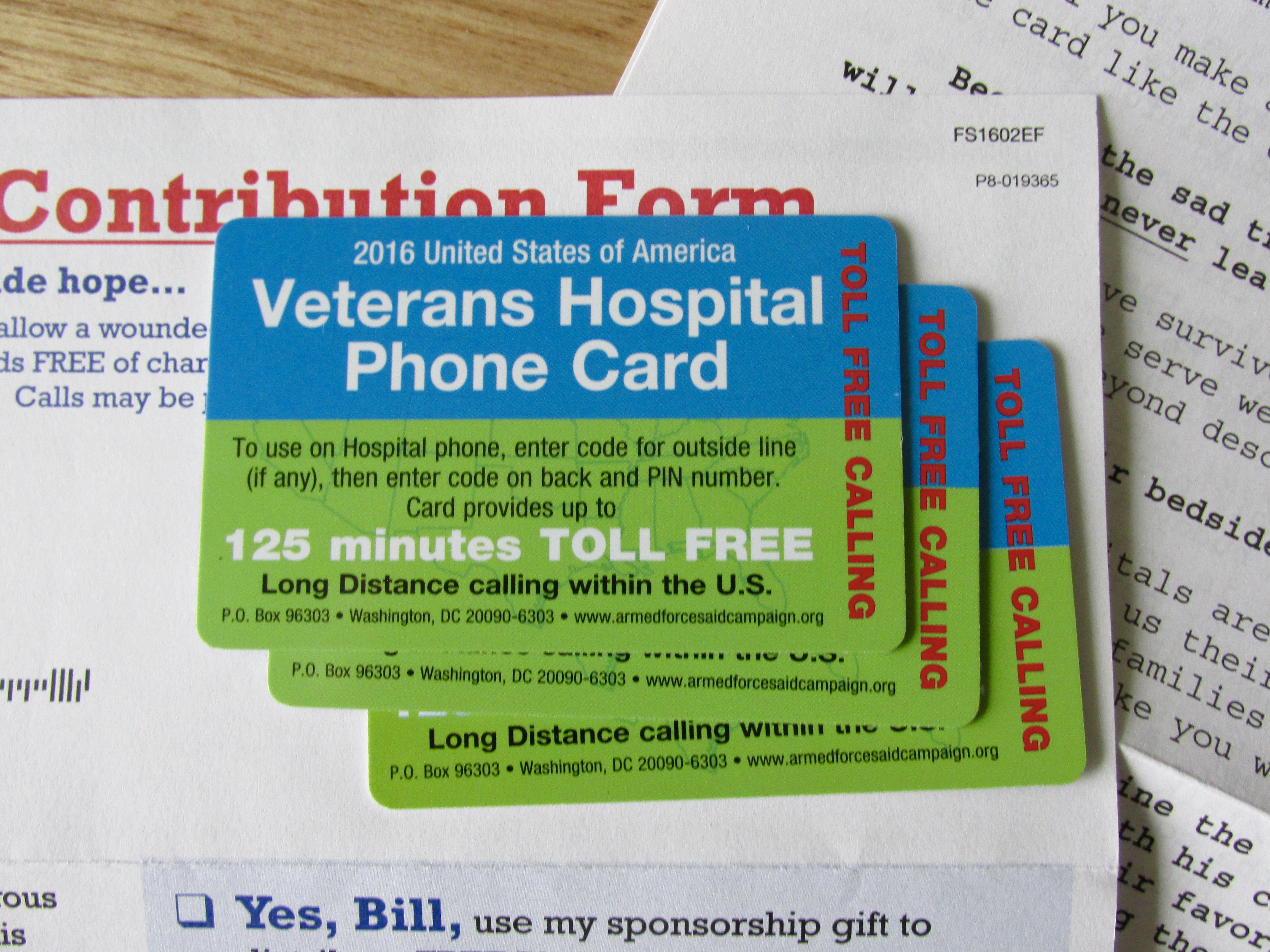
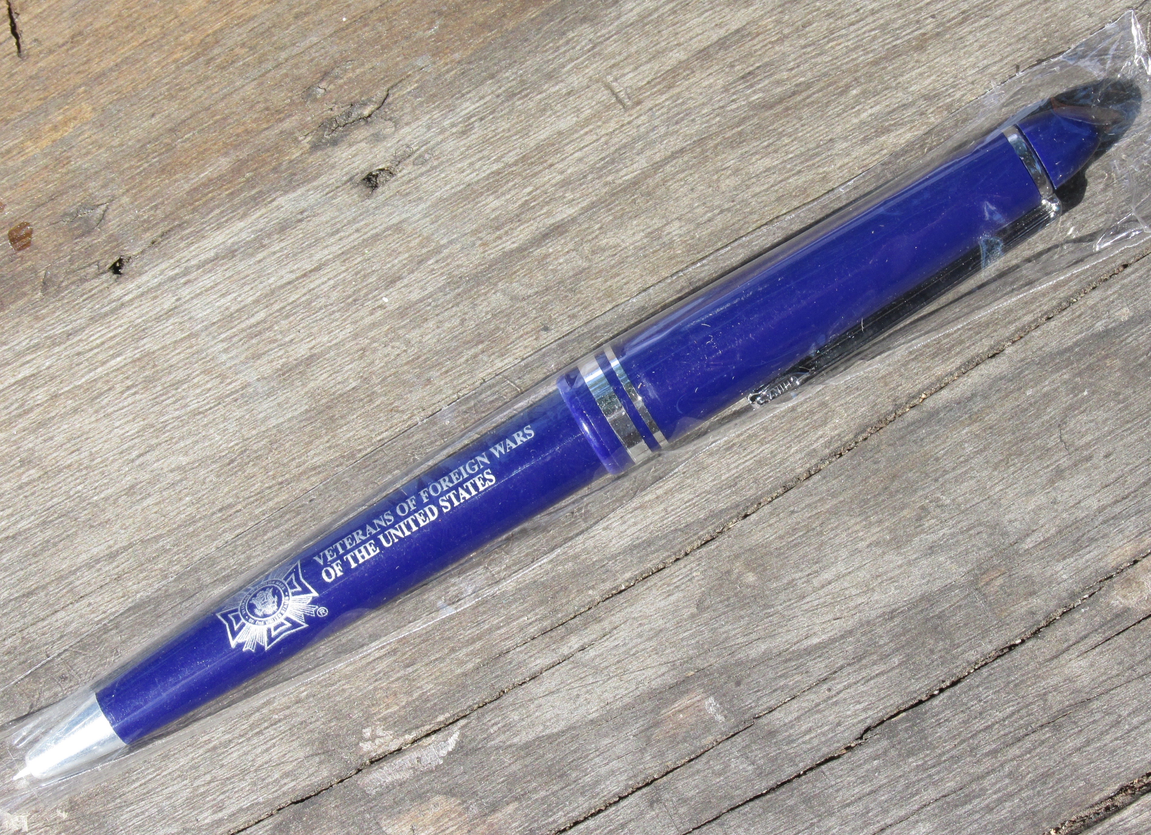
Calling Cards

IMG_5174

Ersatz calling cards stuck in place to get the letter opened.

Help Our Wounded, and Armed Forces Aid Campaign have learned how to affix 3 plastic phone cards to a page.   Technologically, this is pretty cool, if not done by hand.  The cards are stuck on top of each other and appear jumbled through the large glassine window….as if they were thrown in quickly, sealed and run off to catch the 3 o’clock mail.  The impact, especially for the uninitiated such as me, is strong.   Their job is to get the envelope opened, and indeed, the ploy works.   Help Our Wounded, aka Healing American Heroes is not found on Charity Navigator.   My bet is the mailing costs 50-60 cents all-in.

Going For Our Stronger Feminine Side

IMG_5180

A pretty package with writing in mind. This one’s for Gramma.

Disabled American Veterans is the senior classman in veteran’s charities.  Despite that, they have assigned a female status to my record, so I receive kits that reflect more genteel tastes than one might expect.   Putting the gender bias aside, especially in North Carolina, this kit is in keeping with DAV’s efforts to send along quality gifts.

I can’t use any of this one, which is resplendent in lavender-hued Forget Me Nots.   Still, if I was desperate, making a struggling attempt to write to my passed on mother, or to scratch out a hasty last will and testament, I have notepad, and mauve colored, simulated vellum sheets for assigning my debts to chosen in-laws.

The kit is tasteful, if gender specific, and is certainly an eye opener.   DAV also uses real stamps on the reply envelope.  While the accountants may come unhinged at this largesse, DAV’s frequent use of the costly stamps is proof that the presumptuous gesture works in bringing in more donations.

One wonders how many codgers will steam off the stamps, versus cross out DAV’s return address and use the envelope to pay their water bill instead.

All in, this piece must tip the scales at $2.00 in the mail.  But it works.

Subtle and Cautious

USO 2016-05-02 185

Creative use of stamps–just enough to impress, but maybe a challenge for the USPS accountants.

The USO is the most conservative kit to ask us for a donation, and that is in return for a genuine Stars & Stripes Flag plus good feelings.   I included this under-played kit because of their creative use of postage.

Non-profit letters get a privileged postal rate, somewhere between 8-18 cents depending upon address density and automation compatibility.   USO chose to affix 5-cents worth of stamps to their outer envelope, and to use their postmark (#440) to make up the difference at the counter.

Their reply envelope reveals their cautionary approach to wasting postage money.  Rather than place the full 49 cents on the envelope, like DAV, they are willing to go for 5 cents, but left the Business Reply Mail (bill us) indicia in the corner.

We guess that this itsy-bitsy effort will drive the postal accountants nuts.

In the mail cost: 40 cents, tops.

Drop Another Nickel

Paralyzed V 2016-05-02 187

Just when you thought the nickel was yours, they want it back.

Paralyzed Veterans of America is one of several charities which has a conveyor belt from the US Mint to their mail room wherein millions of shiny new nickels are deposited on glossy label stock letters.

Just yesterday we discussed at lunch how many of us keep the nickel, which after all, adds up when everyone is mailing them, March Of Dimes excluded.

PVA’s piece is a max-sized letter, 5 x 11-1/2.   This is a smart move because the postage is the same large or small, so you might as well get the most paper into the package that you can for the same price.  However, nickel-enhanced gold foil labels are heavy, so the rule is to keep below 3.3 ounces or the rate goes through the roof.   $1.25-$1.50 in the mail.

Did You Get Our Card?

IMG_5188

Flowers, fuzzy puppies and kind sentiments… a happy birthday for some one.

The Veterans of Foreign Wars by comparison uses a tiny 3-3/4 x 7-1/2 envelope, aka a “Monarch” to ask the nagging question, “Did your special edition birthday cards arrive?”   Somewhat reminiscent of the neighbor’s kid who knocks on our door to sell Christmas wrap.  We still have six rolls from last year.

Well, yes, the cards did arrive.   I am sorry, but so far I have not found a suitable target for them which are best described as lovely and softly sweet.   My Mom might have liked one, but not from me.   Again, these are estrogen-energized, and if I get my hands on the person who tagged me as female, I am going to scratch their eyes out.

A simple little kit, probably 40-cents in the mail, at most.

How Do They Make Any Money?

As you can see, these kits range in cost from 40 cents to perhaps $5 each all-in.   Can a non-profit actually make a profit from these mailings?  Check the Charity Navigator for details. You will be enlightened.

But realistically, the acquisition of a brand new donor will always be at a loss.  The strategy is to keep that donor giving for a long time afterwards, hopefully with a final bequest of planned gift when they pass on.

accountant

“How the @#$%^%$$ will we ever make this work?”

For the accountancy gene in you however, rest assured that every fundraiser has a donor acquisition cost they won’t exceed.   This is the anchor point in a campaign.  To respect that restriction, a good forecast on the cost of a response is to divide the piece-cost by the expected response rate.

For instance, a piece costs $2.00 in the mail.  This is big money, and the accountants are squirming in their chairs.  But the marketing folks believe the kit will get a 7% response.

$2.00/7% = $28.57 cost per response.

If the charity can show that a new donor at that cost will stick around on average for 5  years and return $150.00 in donations, then that is a reasonable investment.

Meantime…

We are digging in for more incoming mail.   Hopefully without flowers.

Thanks for reading!   We do support our Vets and and respect all that they do.  If you are inclined to donate to a cause, check out their website for a financial report, or visit  Charity Navigator.

Standard
direct mail, Economics, Marketing, Media

Awakenings: What Happens When USPS Cuts Prices

Spoiler Alert: This Is All About Direct Mail Math

It was not a well publicized announcement, 10 days before Christmas, that the USPS will most likely cut the price of a first class stamp by 2 cents, April, 2016.  That’s a 4% cut!

Whether the consumer figures out that a letter will mail for only 47 cents is a question, but for the direct mail community, the news is big.

First of all, direct mailers don’t talk cents. They communicate in thousands. (‘000’s.) A 2-cent drop in mail cost is worth $20 per thousand pieces mailed.

Hopefully the marketing folks at USPS have now awakened to the merciless mathematics of direct mail. In the civilian world, when we experience a cost of living increase, we suck it in, or look for a raise in pay to compensate.

In direct mail however there is a brick wall facing an increase in mailing costs.   The reality is, mailers don’t manage by total program cost. Rather, they manage by cost per response.

For instance, if a charity spends $1,000 to mail 3,000 letters, it is because they expect to get a 2% response…60 donations, at a cost of $16.66 each.

That cost per response (CPR) is bedrock..an anchor around which all other budgeting decisions are made. So when the USPS issues a 1% increase in postage, the CPR goes up, which is unacceptable.

The Story Behind The Story

When the post office raises its prices, we experience the inelasticity of direct mail performance, because mailers must preserve that cost per response.  The only way to do that is to spend less on something else, and that is exactly what happens: smaller envelopes, fewer pages, cheaper paper, less ink, for example.

The bogeyman in this reduction process is that the cheaper the package, the lower the response, which drives up the cost per response again!

The end game option in this vicious circle is to cut out lower responding markets, by mailing fewer pieces, and diverting funds to other direct media.

None of this helps the USPS.

Mail Trends 2008-2015 Prove The Point

In 2007 the USPS delivered 104 billion pieces of direct mail, its highest performance in a 240-year history.  Next year, the U.S. economy had a collapse, and there was a 4.3% drop in direct mail.  In 2009, there was another drop of 16.8%, eroding 21 billion pieces over two years.

Slide1

From 2007 to 2015 Direct Mail volume shrank 24 billion pieces.

Revenues likewise fell from $20.8 B in 2007 to $17.3 in 2009.  $3.5 billion dollars–gone.  Looking for cash, the USPS raised its prices nearly 13% from 2006 to 2009.

The bottom line is that the USPS has held direct mail revenues in the $17 B tier ever since, with three more price hikes from 2009 all the way up to 2015.  Its actual revenue per piece has gone up from 20 cents to 22 during that time.  Direct mail volumes have stabilized around 80 billion pieces, down 23% from its stellar 2007 year.

What You Don’t See

Slide2

Revenue per piece grew 10% while weights decreased 13%.

While the USPS has been able to weather the economic storm, the quality of mail has deteriorated.   In 2007 the average piece weighed 1.83 ounces.   In 2015 that shrank to 1.60 ounces, a 13% decline in paper, ink, pages and envelope.  More post cards, fewer envelopes, fewer flats.

The irony in this is that the USPS is actually earning more money for every ounce delivered: 11 cents in 2007, versus 13.8 cents in 2015, a 25% increase.

The Good News

A 4% reduction in postage in 2016 may not mean much to the consumer, but to the direct mailer, it opens the door to better creative, design, and production.  These lead to better response, lower cost per response, which drives up mail volumes.  Whew!

This price cut is good, good news.

PS: Kudos to you for getting through this important math lesson!  Please share.

PPS: You can check all the numbers by reviewing the USPS Revenues, Pieces and Weights report which they faithfully publish very quarter.


Standard
direct mail, Marketing

Your First Impression Won’t Be Your Last

IMG_4041

St. Joseph’s Indian School delivers the piece de resistance.

You know it’s Fall when the big fundraising kits stuff your mailbox. This year we have a surfeit of gifts from direct mail fundraisers.

IMG_3743

Father Flanagan’s Boystown stickers for identifying anything that moves.

Years ago the pioneers in the business presented us with address stickers.

These we have dutifully paid for and have now labeled every moveable item in our home: CDs, iPads, iPods, iPhones, chargers, golf clubs, cassettes, Walkmen, books, staplers, rulers, vinyl… luckily we don’t own a pet.

The ante was raised by the March Of Dimes who gratuitously presented us with a small monthly stipend of ten cents: a shiny new dime pasted to a donor form.

IMG_4037

Food For The Poor’s coins… how can you just pocket them?

That munificence has been outpaced by Food For The Poor who made change for the dime, and sends us a penny and a shiny new Jefferson nickel. That’s a 40% cutback, but insertion is more costly, so it’s a wash.

Not to be outdone, Disabled American Vets provides a 9×12 calendar, which we can place beside the 10×20 calendar from Boys Town.

Of course, wall calendars are bulky, so we are grateful to St. Joseph’s Indian School which gave us a 4×6 calendar booklet for the purse. I am waiting for the 3×5 that fits in my shirt pocket.

IMG_3751

There’s no excuse for not writing….here’s a VFW pen.

The mailing industry is of a generous culture though. With all these other possessions, we have also received dozens of greeting cards: whole writing kits, with pens, to reach out and greet someone– anyone.

Oblate Missions has sent us so many Christmas cards it may be easier if we send them our Christmas mailing list instead.

IMG_4040

Catholic Relief Services’ prayer medallions.

You can’t blame an organization which does its part in reinforcing the goodwill that blossoms from receiving a greeting card in the mail.  I am all for it.

As a sidenote, the USPS post office in Libertyville has a well designed rack of greeting cards for sale.

This one cartoon I loved for its text:

Outer Cover: “Wow! You got a real, honest-to-goodness card! Not a text.  Not an email!”
Inside Caption: “Wow! It has an inside too! It just gets better and better!”

In one of their early bold moves, Disabled American Veterans pasted 45 cents in stamps onto their reply envelopes. Overflowing in confidence that once we saw the postage in place, we would feel obligated to fill the envelope.

IMG_4035

Marines Toys For Tots and Wounded Warriors provide your stamps.

Even gutsier, Wounded Warrior Project and Marine Toys For Tots are paper clipping custom 47-cent stamps to their letters.   This is very expensive, as Stamps.com provides these stamps at a hefty premium.

The strategy works though.  Can one really use the stamp for anything other than a gift without a stab of guilt?

IMG_4043

To avoid being pressed into service, British sailors eyed their brew from the bottom up.

The gifting brings to mind the old conscription practices of the 1700’s when British sailors were pressed into service when they drank from a tankard of ale, only to find the King’s shilling in the bottom.   By unwittingly enjoying the beverage, the sailor had been hired.

I think of that clever ploy as I pile up the loot, especially the coins and stamps.

The mailers know what they are doing. Despite all common sense, they have proven that the unsolicited gift still wrests outlandish response rates and donations. And once you are hooked, they will be back until they end up in your Will.

That’s right. Planned Giving is a part of every established fundraising strategy, and if you asked, many organizations can tell you which of their huge bequests started with a direct mail gift, years before.

IMG_4033

Fleece gloves… probably a postal nightmare, but still handy.

This season’s most impressive packages included one from Kids Wish Network, which sent along a pair of fleece gloves.  They arrived in a lumpy wrinkled paper envelope I am sure that the post office would rate as “baggage class”.

But how do you throw those out?   What tight fisted non-donor could wear them, especially when the writer suggests: “When you use the deluxe fleece gloves I sent you, I hope you you’ll remember Wish Kids like Tabitha…” .

The penultimate delivery however, the cream of the crop, the ne plus ultra, is the bulging envelope from St. Joseph’s Indian School.  No doubt USPS rated this one as “duffel bag class”.  Inside we found the usual and generous complement of address labels, gift stickers, 4×5 note pad, 5×7 note pad, pocket calendar, wall calendar, personalized calendar card, and 3 shrink wrapped greeting cards.

IMG_4036

St. Joe’s mystical Dream Catcher, not to be ignored.

In addition however there was a most unique and unusual item, a genuine facsimile of a Lakota Indian Dream Catcher.

The Dream Catcher is a little hand-made assembly of string net, naugahide, beads and feathers.  Mounted on die-cut foam core, it is shrink wrapped with colorful operating instructions ending with: “to be hung on the tipi or lodge and on a baby’s cradle board”.

I have to admit, I had to dig through pounds of newspapers and old phone bills to retrieve this package from our recycling bin.  There is something especially foreboding about disposing of the St. Joseph’s piece so casually.

IMG_4039

The Marines Toys For Tots medallion, struck with the USMC shield and Semper Fidelis on the other side.

Yes, in the past, I have taken all the coins, scribbled on  lots of notepads, hung countless calendars, and stuck hundreds of stickers without a moment’s guilt, or nearly so, but the Dream Catcher had me netted and nettled.  This one item–which I would never purchase on a dare–clinched the deal.  Just how unlucky could my life turn out if I didn’t give due respect?

So it’s hanging over my DAV Certificate of Merit.


Thanks for reading!   I hope you find your charity of choice this season.  These organizations are especially effective, and they mind their pennies too.


Standard
direct mail, Economics

All That Glitters

IMG_3733

The solid gold gift pack. Gotta open it.

Our mailbox opened this morning to present a gorgeous golden Flat from Veterans of Foreign Wars.

It is highly improbable that the recipient of this gilded kit would toss it in the bin without at least checking to see if there was a $10 dollar bill waiting inside, too.

Just might have been too, considering the total payload we discovered:
-12 Christmas cards and envelopes

IMG_3739

12 Christmas cards and envelopes, a big offering.

-1 gift bag

-1 pen

-1 calendar card

-1 set of gift & address labels

Of course, there was also a letter/donor form and BRE.

But two unusual items cropped up.

IMG_3749

The gift bag, big enough for a ham sandwich.

First, the headline alerted us: WOUNDED VETERANS ARE IN CRISIS.

If you are at all disposed to the plight of these warriors, as countless Americans are, you are going to open this labeled treasure chest to see what the crisis is.   Foreclosure on the home?   Withdrawal of benefits?   Family disintegration?   What is the crisis?

IMG_3735

Crisis: a powerful set up.

Inside, the letter launches in to a completely different train of thought: “When we began sending out these free special edition Christmas cards and other gifts, people said we were crazy.”  Only three paragraphs later do they mention the main focus of their cause: the wounded Veteran.

Version 2

The non sequitur: handwringing debate about cards.

While this may seem nitpicking, the golden rule of good headlining is to pay it off.   VFW brings the reader to the edge of their seat, and then chats away on the frivolity of costly free gifts.  Crisis takes a back seat.

The second wrinkle is more about economics, and a good lesson is taught here.  This 6.8-ounce kit probably cost $2-$4 dollars each, all in.   Conventional marketers would roll up their eyes, cross themselves and close the garage door before spending that kind of money, especially when the response might not break 5%.

IMG_3743

Labels and stickers, a fitting complement.

But what if it does?   The real question is, what’s the average gift, and how long before it pays itself off?

So assume for a moment this scenario:

Mailed 10,000 at a cost of $40,000.  700 donors, at a cost of $57.14 each. Response, 7%.  $17,500 in gifts.  Average gift, $25.

IMG_3751

Cello-wrapped pen.. not since Time magazine!

What does VFW have? 700 new donors at a net cost of $32.14 each.   What are the odds that over the next five years, the group will turn in another $100,000 through renewal mailings, bequests and planned giving?   Pretty good, actually.

Version 2

This compliant disclosure gives pause to the reader.

It’s all speculation, of course.   For some background on VFW’s fundraising success, check their website for its latest financials.   Total gifts, $66.8 million, fundraising expenses, $25.6 million.  Roughly 2.6/1.  By comparison, its major competitors turn in gift/fundraising ratios of 3:1 up to 7:1.

The challenge is knowing in advance what the numbers can, and need to be.  Here is a formula worth knowing–witnessed by a fly on the wall of VFW, where for a fictional moment, you are now working.

Budgeted Cost per Piece

Your boss went sideways over the cost of the Gold Lame’ package.  Piqued, she said the gross cost per response can’t exceed $32.14.  You blurt out,

“But that’s the net cost on our Vanilla kit.   Gimme a break.”

“Give you a break? I have to explain this gold cadillac to the board.   If it doesn’t beat Vanilla, I will be back in community service, and you will be on the phones while you are licking envelopes.   Got it?”

IMG_3745

Gifts up to $500. If you don’t ask…

So you have a ceiling: the cost per response must not exceed $32.14.   Historically, you have generated a 3% response on the Vanilla conventional mailing format.   The all-in cost of the Gold Lame’ must not exceed $32.14 times 3% = $0.964 each.

Impossible.  The vendor stares through you with crocodile eyes.  Three bucks without postage, he grins.

But you feel strongly about Gold Lame’.  Your all-in piece cost totals $3.75.  Divided by the boss’s ultimatum, $32.14, you need 11.67% response.   Phew.

At this point, you wake from this disturbing nightmare.   Will Gold Lame’ quadruple Vanilla response?   We may not know, but at least you know the formula to weigh the risk.

Remember: ($ piece cost) / ($ response cost)  =  % response

Now, back to our piece.

  1.  Fix the headline to set up the letter, or change the letter to pay off the headline.
  2. A bold choice of cards: an unabashedly Christmas theme.  Just make sure your list is of that persuasion.
  3. The donor form offers 8 gift choices, from $10 – $500.   Good!
  4. Lastly, the prepaid BRE is worth it.   Whole campaigns can falter for want of a postage stamp.
  5. Mail it.   Whatever the response, whatever the gift, if you don’t test, you will never know.

Lastly, find a good quote to share with your boss, something like Teddy Roosevelt’s, “better to have failed while daring greatly than to live with those cold and timid souls who have neither known victory nor defeat.”

A little wordy, but it may work.


Standard
direct mail, Marketing, Sports

Mail Order Magic: The USGA Doubles Down

golf_grip_1

Marketing: a good grip that doesn’t let go.

The challenge of any direct marketer is to hold the enchantment of the buyer from the moment of first interest until the next order.  Let me tell you how the United States Golfing Association had me firmly in their grip.

Mind you, I have always been attracted to mail order.

robinhat

First mail order purchase.

As a kid, my first experience with mail order was a Robin Hood hat off the back of a Quaker Oats box. I wrote them a letter with a dull purple crayon. Two box tops, a quarter, and four weeks later, I was decked out in a lincoln green cap complete with turkey feather.

Moments later I dissolved onto a path through the tree line behind our house, earnestly in search of rich people to steal from.

My brother and I followed up with another offer, this time, a potato gun from Nabisco Shredded Wheat. More box tops, more coins, more waiting, and our ordnance arrived: two shiny, plastic, blue and red hand guns.

Phil Cowboy825

The properly outfitted small arms mail order buyer.

Operating instructions were basic. Stick the front of the barrel into a potato, and pull away a small plug about the size of a pencil eraser. Choose a target. Pull the trigger. The little wad of potato would fly across the living room and roll to a stop under the couch.

After a couple of potato bits wound up in the electric space heater, the jig was up.

But the magic remains.   It’s important for cataloguers, mailers and weekend supplement advertisers that their buyer squeezes every bit of enjoyment possible from the order cycle.

The Hat: Mailorder Delivers!

The Hat: Mailorder Delivers!

There is an inexpressible excitement in opening a long awaited package sent by complete strangers, far off and away.   I had sent in my USGA membership renewal, and according to the letter I would receive a hat: an orange 2015 USGA Chambers Bay Open cap.  I already had one, but if it blew away, I’d have back up.

I am certain that the USGA Board of Directors convened a special meeting, extensively reviewing my  application before granting my membership extension for another year. A no brainer for them, this was an important symbolic order of business, for which they would levy a $15.00 fee against my credit card.

From there, I visualized urgent instructions hammered out on the teletype, dispatched to the membership fulfillment department, ordering them to rush a member package to our home, sparing no cost.

IMG_3522

The long awaited, hoped for package arrives.

Like a glistening white, dimpled Titleist, teetering on the edge of the cup, I waited by the mailbox.    This week, the USGA kit arrived.

Inside the lumpy plastic package I found my new member card, and a bag tag, branded with my name, and a framable picture of Chambers Bay, site of the 2015 Open.   And more…there inside the package was a new hat–but it was gray.

IMG_3510

Surprise! A new hat!

Was there a mistake?

No!   This hat is for the 2016 Open in Oakmont.   I have no idea where that is, but according to the hat, there are squirrels, and acorns.  Perhaps there are groundhogs too.

But the USGA prize committee could not contain themselves by merely presenting me with a new lid.   They also sent along a USGA 40th Anniversary metal ball marker.

IMG_3497

Double surprise! A ball marker!

This little disk is used to mark the fictional place of my golf ball as it rests closest to the pin.   I have never had the pleasure of seeing that, but I hope to one day.

IMG_3509

But wait, there’s more. It’s magnetized.

Even better, however, the prize committee designated that the ball marker have a special place of its own: it attaches to a magnet on the visor of my new cap.   Wow!   Like many bad hooks off the neighboring tee box, I truly did not see this coming.

Of course, the cap is firmly held in place even on the windiest fairways as the magnet rests over the metal plate in my skull.

Just kidding.

Years ago we were introduced to the concept of lagniappe.  This is the art of giving a little extra.   It wins a customer for life.  Good marketers always work lagniappe, and the USGA has cultivated the technique.

IMG_3520

The course beckons; the marker is poised.

With luck, they may someday improve my game.

Thanks for reading!  Please share.  Oakmont is outside of Pittsburgh, PA.

Standard
direct mail, Marketing

Why Some Envelopes Get Opened Faster

IMG_2660

Uh, no parking after 5, please.

Life deals ironic hands to all players.  Timing is everything.

Last week, a fast moving car barged through the corner of our house leveling three rooms. Radiator coolant ended up on our coffee table.

Physicians 2015-04-16 594

“More than you know, Mr. Brown!”

This week, we received a mailed life insurance  offer from Physicians Life Insurance Company.

Regardless of circumstances, this envelope would get opened, and here’s why.

Physicians 2015-04-16 593

“Please Keep It In A Safe Place” is an arresting instruction.

Your Beneficiary Card is Enclosed. Please Keep It In A Safe Place.

The #11 envelope starts with the cautionary instruction above, and has a tiny die-cut window revealing a scannable OCR-A number, the inferred key to wealth for my beneficiaries.

It takes an iron-hard constitution not to open the envelope to see what is inside.   And true to their word, Physicians has attached a varnished card to the letter enclosed.

Physicians 2015-04-16 597 CARD

The card is a token, and as promised on the envelope, to be saved. Note the 800-number.

Let your beneficiary know you’ve applied for up to $10,000.00…

The bold, 16-pt. font is positively encouraging. Congratulating us as Illinois residents, aged 45-80, which suits my wife and I respectively to a tee in her opinion, that we are guaranteed a Secure Promise Plan.

They prompt us to ask our beneficiary to keep the card in a safe place.   (But in your case Mr. Brown, not in the back of the house.)  It didn’t actually say that, but the suggestion is uncontrollable.

Physicians 2015-04-16 597 Johnson

The headlines: we are eligible for a guaranteed policy. Details to follow.

These are powerful words, usually reserved for protecting wills, social security cards, PINs, firearms and Pokemon.

The following letter reverts to 12-pt courier, fixed space font, as if it came off the very typewriter we keep next to the rotary phone on our vestibule in the front parlor.

Physicians 2015-04-16 596

Straight forward benefit headlines. Orderly, easy to read.

It is only moments later that my suspicions are confirmed that we don’t actually have a policy yet, but if we just apply by May 4th, we are golden.

The Bottom Line

Physicians 2015-04-16 597

Courier font: back to the 60’s! But it works.

Physicians wrote perfect copy, presented by a hard working envelope.  Most important, the enclosures pay off the reader’s expectations, and have shifted into second gear with an orderly sales presentation.

Everything is according to the rules, and you can bet the Physicians legal crew spent hours in the office before retreating to the golf club lounge vetting the whole kit, extending their discussion out to the first tee about the careful use of commas.

Physicians 2015-04-16 595

Policy details on varnished filigreed paper. Impressive, but not pretentious.

From the prospect’s point of view, life insurance is not an impulse decision for most people.

Still, for those who might be teetering on the edge, like us and the lucky folks in the car, the Physician’s package gives pause to consider.   And the sale is entirely dependent upon the envelope getting opened, which this piece accomplishes.

Radio, TV and web don’t hold a candle to direct mail when it comes to delivering all of the decision-making tools…on workable, readable, paper.   The deal, the sales support, the application, and prepaid reply envelope, complete with return address are presented for thoughtful consideration.   But it’s the envelope which kicks it off.

Let's put the meter by the commode.

Let’s put the parking meter by the commode.

Meanwhile, we are rebuilding our house!

Standard