direct mail, Economics, Marketing, Thank You

Ten Reasons You Should Thank The USPS

Teddy StampWe are all cheesed that the USPS is looking for a 1.97% increase in postal rates.  But before we run to our social media to complain, let’s open the envelope.  What are we getting?

1.   Door-to-door, pick-up and delivery.   Not only does a real person come to your home to deliver mail, but they are charged to pick it up, too.   Beats driving downtown.   And they do this 6 days a week.

2.   Equal representation.   The USPS is probably the only government institution which situates an office based on population density, rather than political handouts.  For sure, it’s the only federal presence in your community that isn’t there to administer laws and levy taxes.

3.   Legal authority.   A USPS postmark is an official seal, and when your letter is in the system, it’s a completed act.

4.   Jobs.   The USPS employs over 600,000 people.   It’s also the network that directly supports another 1.3 million people who use the mail to make a living, according to the Direct Marketing Association.

5.   The Grid.   There are 142,000,000 delivery addresses in the United States which are visited daily by the mail person.   The USPS grid is like a vast capillary system that beats nationwide, touching the most distant extremity.

6.   Innovation.  Maybe hard to believe, in the face of digital networks, but the USPS has refined and streamlined delivery to the point that it is cheaper to mail a letter today than it was 10 years ago.

7.   Protection.   Your mail is protected by federal law.   The space inside your mailbox is federal property.  The blue boxes situated across your community are safety deposit boxes, in effect.   Drop your mail, and it’s secure in the system.

8.   Culture.   What other government body continually picks new designs to celebrate on the face of a stamp?   Rock stars, writers, artists, scientists, athletes, discoverers… and they are BIG stamps too!

9.   Resilience. Despite a whirlwind of communications technology advances, the USPS still has cache, delivering nearly 500 million pieces a day.   When was the last time you saw a public phone booth?

10.   Fiscal control.   Yes, it has a $5 billion budget deficit.   Works out to $8,333 per employee.   The federal government has a $483 billion budget deficit.   $112,013 per federal employee.   In the bigger scheme of things, go figure.

Nobody likes price increases, but it is a sure thing that the USPS has done leagues more work to control costs than any of its government cousins.  In light of its value, can you really complain?

By the way, the price of a first class stamp remains at 49-cents after the hike.   Good anywhere in the nation.  Buy a bunch, they’ll last forever.

Standard
direct mail, Economics, Marketing

How You Make Personalization Pay Off

Boystown CALENDAR HANGER

A 24-page color calendar, replete with country roads, cabins, barns, flowers and birds…lots of birds.

Personalizing a mail piece comes with expense. You are about to see the motherlode.

Gracing the letter with the reader’s name is one thing, but it’s quite another to match that to the envelope. For the fully committed direct marketer, there are personalization payoffs, and Father Flanagan’s Boystown shows us how.

Boystown Envelope

An outer envelope promising lots, and delivering, too.

BoystownBooklet Bird Jan

January.. from the 36-pager booklet, with more birds…growing in numbers.

Just before Christmas we received a 9 x 12 envelope from Boystown announcing their 2015 appeal. The donor acquisition kit weighs about a third of a pound, which is huge. The outer envelope calls out, by name, that FREE Special Edition Gifts are enclosed.

“Free Gifts” is right. They send three calendars: a 24-page hanger for the wall, a 36-page purse calendar booklet, and an 8-1/4 x 10-3/4 calendar card.

Boystown    color labels

The color label sheet. High quality and keepable.

The whole collection is covered in Sam Timm nostalgia art: winter ponds, chimneyed log cabins, old trucks, old boats, old canoes and birds…. enough birds to awaken Alfred Hitchcock one last time.

Boystown    028VGF Calendar

Another calendar, this one with a stylized street sign.

But the overwhelming effect comes from the personalization. Father Flanagan has managed to personalize 8 pieces in this whopper kit: the envelope, the letter, the reply form, the reply envelope, two sets of very nice address labels, a certificate and a calendar card.

Boystown  Certificate

It’s only an acknowledgement, but hey, it’s framable.

Over the top maybe?

Boystown Johnson Box

A Johnson Box, personalized and tinted, captures the gist.

Not really. Remember, good direct mail is designed to be indispensable.   It is extremely difficult to throw out a kit when your name is woven into its making so admirably.   The proof: this is a control package, or very similar to past controls. So it is working.

What’s the math that supports this?

The kit itself probably cost around $1.80. Postage for a 6-ounce Flat at non profit rates is actually a bargain, add another 30-cents. Total cost in the mail, probably $2.25 after adding list and processing.  This is a guess, only, having not spoken directly with Boystown.

Boystown Gift Certificate

Individualized gift certificates, one of three.

Now, the hard part: getting paid. Assume the average gift is $15. To break even, we need a 15.0% response. ($2.25 divided by $15.00 = 15.0%)

And the really hard part: they probably won’t get 15.0% response.   More likely, they might achieve 8-10%.   Let’s say 10%.  So given that, every response came at a cost of $22.50 ($2.25 divided by 10% = $22.50).

Boystown Donor Closeup

A strategic gift choice, Goldilocks-style. Let’s go for $15.00!

Is a new donor worth $22.50?   The answer is, “yes”!

By Father Flanagan’s 2012 financial report, they derived nearly $5 for every dollar spent in fundraising.  A very acceptable payback according to industry standards.  By the numbers above, the new donor will continue to give over time, well in excess of $113.00.

Boystown B&W Close Up revised

A set of stylish B&W labels in case I don’t want to give away the birds.

BoystownBangtail Reply

Personalized donor form and reply envelope. Note the QR code for tracking!

Again, this analysis is my perspective only, but a donor will continue to give to a worthy cause, especially one as well branded as Boystown.   And not only will they give today, but some will most assuredly make bequests after passing to keep the institution providing its valuable service.

So personalization plays a big part in winning support, and the savvy marketers at Boystown have done their jobs well in making it pay for their cause.

Thanks for hanging in to read all those numbers!   FYI, Boystown provided nearly $192 million in services in 2012, and in 2013, served 122,000 children and families across America.

Standard
direct mail, Marketing

Pretty Ain’t Pretty Sometimes

Hospital 978

A 2-page high color sell sheet, but no letter!

When you are on the marketing end, you may feel that direct mail, especially fundraisers and business mail, looks pretty vanilla. Maybe even bland.

So the urge is to pretty it up.

Hospital 976

The hospital’s familiar happy logo is disguised here, but this envelope brings no bad news.

That is the case with this fundraising piece for a well known children’s hospital. For its sake, anonymity will prevail. But here is a 7-step rule book on designing fundraising mail.

1. Set the mood for urgent need.

Hospital Sneakers copy

A snappy colorful tease, but is it urgent?

To that end, use color and graphics sparingly, to best create a tone that delivers gravity, not levity.   The envelope for this kit displays a cheery logo (disguised here) for the hospital. Understandably, it wants to convey happiness for its patients.   But that’s not the right strategy for getting financial backing.

The OE features a spunky new pair of pink sneakers teasing the story of a cured patient, whose story is inside.

The “story inside” teaser is good. But the sneakers remind one of a Saturday morning kids TV show.  Pretty, but not important.

2. Follow up with a personal request.

One of the most recognized personal media in existence is the letter. When we open an envelope, we are looking for it. The letter sets the agenda for the potential donor. This is who we are.  Here’s our challenge, and how you can help.

There is a myth that people no longer read letters, and certainly not long ones.  Not true!  If your story is real, and the request is sincere, the letter will be read.

Hospital Cougar copy

A potentially compelling story is delivered in challenging, small white type against a pink background.

Named, titled and signed, the letter provides basic credentials. A person is “at the other end of the mail box”.

This piece has no letter, but rather hangs its success on a two-page high color sell sheet.

3. Demonstrate and prove the wise use of donations to solve the problem.

Convince the donor that money is needed, and that it won’t be wasted.

The hospital has a goal of $135,000. What for? It is not apparent that it is short of funds, or solely supported by charitable donations. Not knowing that, why would a donor be moved to give?

Hospital Circles copy

A logical effort to monetize the services provided. But what are the Circles all about?

To its credit, the hospital does explain what your money will buy. It also presents operating statistics, and some official endorsements.

To put an edge on the numbers, show how many cases were turned away or disadvantaged for lack of funds.

4. Be legible and understandable.

Possibly the most difficult task of a senior donor is to read copy that is too small, and reversed out.   In this case, important “ask copy” and narrative is in 8-point type, white on pink. Pink on black. Blue on white.  Ouch!

Hospital Key copy

The significance of the “Secret Guide” is just that: secret.

This piece also employs some secret code, uninterpretable by the cold prospect.   The use of their “key” logo is un-explained, and a series of icons on the pledge card do not telegraph any meaning to the uninitiated.

5.   Tie the Ask To A Specific Need.

The story in the piece relates to a child’s full recovery after an accident.  The pledge card, and supporting copy don’t connect to the child’s need, or to the next child with a similar accident.

The list of financial values and associated services in the ad piece refer to Circles of Commitment and generous benefactors, but the recognition value of the Circles is not explained.

6.   Urgency.  

Any mailing’s strategy is aimed to get a response immediately.   Hospital $135,000 copyThis fundraising piece needs  some parameters to define the timely need for a donation.   What will happen if they don’t reach $135,000?   When will time run out?

7.   Indispensability.

Hospital 980

The mystery of the icons: how do they work?


The best direct mail is impossible to throw out.   It just sits there on the kitchen table, or on the dresser until the responder finally acts.   This piece lacks that important nagging factor.

A gift, a freemium, a stamp, a coin, a sample, a personalized card, a photograph, an address label set, are examples of items that  are hard to ignore.

Unless the donor had already decided to contact the hospital, or the donor’s accountant recommended more charitable giving, there’s no reason to hang onto this piece.

Hospital $500

$50 bucks? We haven’t even met!

Direct mail design is challenging because the mailer gets bored with the “same-old, same-old”.  There is a temptation to jazz up the piece just to be different.   After all, you mail out a few thousand, or a few million, and they all look the same!

Just remember: the recipient only gets one piece, and to that person, the piece is well distinguished, just by its mere arrival.

Thanks for reading!  If your fundraising program is serious, make it look that way.  There’s nothing more serious than asking for money.

Standard
direct mail, Economics, Marketing

AAA Goes Flat Out

AAA 2014-12-02 803

The door opener!

Want to know what stops just about anyone when they open their mailbox?

No, not a boxing glove. Instead, it’s a flat.   No, not a flat tire.   A flat-sized mailing piece.

AAA 2014-12-02 800

The 10 x 12 Flat. Size counts in direct mail.

So it is that I opened our mailbox to be confronted by a certificate-sized 10″ x 12″ envelope. Front and center, in portrait orientation, is an open window. As I peak through I see my name, in bold, printed below a 40-point, gothic type proclamation: Proof of Eligibility.  The State of Illinois is symbolically positioned above.

This manifest is shielded behind a thin sheet of parchment. My reaction? Better open this now.

I am not that naiive, I know this is a solicitation. But still, eligible for what?   Nomination? Higher taxes?  Bronzing?

AAA 2014-12-02 Label copy

A beautiful label… applied on a slant, with raised shading, is actually printed, not real.

As it turns out, it is the AAA Life Insurance Company, who has decided to give me a second chance to insure my remaining days.  Or until the age of 80, when all bets are off.

These are the same folks who sent along a policy kit a few months back.    That one was a flat too: a “fulfillment package”.   Presuming I am ready to sign up, it is essentially a welcome kit.   Regrettably, and unknown to AAA, I am disqualified from obtaining coverage due to a shady past.   So I deferred.

AAA 2014-12-02 eagle copy

The official seal of eligibility.

The reason I highlight the new kit is to point out the allure and attraction of the envelope.  “Proof of Eligibility” is vague.   But when it is presented so elegantly, it works.   How many of your incoming direct mail summons use parchment?   40-point Gothic?   Not much I am guessing, since the Sheriff of Nottingham died.

The design strategy of this AAA kit is to get opened.   My bet is that better than 90% of the recipients do open it.   It is irresistible.

From there, the internals have to carry the freight.

The big question you should be asking is why spend the extra postage– probably 15 cents– to send an over-sized envelope?

AAA 2014-12-02 802

The letter under the parchment, complete with filigree.

Do the math.   In a standard #10 envelope, the kit, list and assembly would cost about $250/m.   Postage, another $200/m.   Total, $450/m.

Now lay the papers flat, and place them in a big envelope instead.   Let’s say the production is cost neutral, but adding $150/m flat postage has just increased overall cost by 33%.

The bottom line in direct mail: raise your production cost 33%, you must increase response 33% too.

So if the small envelope garnered a 1% response, the flat needs 1.33% to stay in the game.

From personal experience, I know this is achievable, and judging from AAA’s use of flats before, it’s probably not unusual for them either.

AAA 2014-12-02 Eligible copyBy the way, what was I eligible for?  Discounted premiums as an AAA member.


Thanks for reading!   Never pass up the opportunity to go “big” in a mailing piece.   The cost may frighten you, but usually higher response will cover it.

Standard
direct mail, Marketing, Politics

Fall Seat Sale: The Check’s In the Mail

RNC  558

A dollar a seat… get ’em while they’re hot!

My walk to the mailbox today was rewarded with a letter from John McCain’s desk.

It was especially exciting to get his letter, because he enclosed a personal check!   Usually this works the other way around.

Anyway, I opened his letter to find a check for $36 bucks.  Unfortunately, or fortunately, depending upon your political stripe, it was made out to the Republican National Committee.

This is a very crafty gambit.

RNC  561 copy 2

Is it really the desk writing?  I wonder.

Seldom do we receive checks, and this one, measuring a modest 6″ x 2-3/4″ looks like the real thing.

What I liked about the approach of this fundraiser was the rationale.   The U.S. Senate has 36 seats up for grabs in the mid-term election, and McCain is donating a dollar for each seat.

I know, I know.  It should be more, but hey, have you seen his suits?

Sartorial comments aside, the dollar-a-seat strategy is a door opener for the tight-fisted, like me.   He is asking me to match his donation.

But I am puzzled. The RNC goes on to say it requires only $8,000,000 in the next ten days.  This seems like chicken feed compared to the dollars normally needed to buy an election.   I hope they know what they are doing.

RNC  557

The envelope needs to be opened, just to see the check!

In any event, they are counting on 222,222 folks like me, at $36 each, to respond.   At a 2% response rate, they must be asking over 11 million people.

I will leave the financial logistics to the back room guys.

I would point out, however, that after wresting $36 from my cold, thrifty mitts, John could have at least coughed up an additional 49-cents for the stamp on the return envelope.

A stamp! A stamp! The Senate for want of a stamp!

A stamp! A stamp! The Senate for want of a stamp!

You see, the face value of a stamp may seem like a lot to the RNC, but in this case, each one is worth $36 dollars.

Don’t forget to vote!

Standard
direct mail, Marketing, Media, Sports

How the USGA Got My Attention, Fast.

My walk to the mailbox this morning was rewarded by an irresistible offer from the U.S. Golfing Association. A FREE hat!USGA 2014-09-15 505 hat

How can you say no?

Their generosity gives me hope, too. This may be the re-emergence of the direct mail gift premium.

Once there was a time when any subscription offer came with a free gift. A calculator. A tote bag.   We even received a world globe from Macleans Magazine.

IMG_1042

A worldly gift with every subscription.

USGA 2014-09-15 504

The USGA wants me. They actually want me!

This kit begged to be opened. Not because there was a hat, but because the USGA had enclosed a card. For me. An official USGA card for a horrible axe-wielding duffer who scores a rambunctious 108 on a good day.

My handicap is so far off the chart I get a special space to park the golf cart.

USGA 2014-09-15 505 card

I am keeping this close by until my real card arrives, with my hat.

Nevertheless, I am moved by the card. I want it. Opening the kit, I am further thrilled to see that I can join the USGA and get a FREE USGA Open 2015 hat.

USGA 2014-09-15 505 slogan

A great slogan. But they don’t know me well.

At this moment, we have approximately 30 hats on the coat rack, all emblazoned with someone else’s logo. I don’t need another hat. But truly, I want this USGA hat.

USGA 2014-09-15 505

A compact offer, with color, balance, and readable content.

It’s like they recognize me. And how I have toiled to write “single-bogey” on a par 3.

Economics: Does This Kit Pay For Itself?

USGA 2014-09-15 505 benefits

All this stuff comes with the hat. How can you decline?

As thrilled as I am, and I am sure countless thousands of other golfers are thrilled at a Free hat offer, will the USGA lose its shirt with this offer?

No way, and here’s why:

All in, the postage and production for this piece was probably 40-cents. Let’s say they mailed 100,000 pieces. That’s $40,000 out of pocket. Now imagine that 2% of the readers sign up. They each pay $10 to join USGA. That’s 2,000 new members, for $20,000.

But the hat probably cost USGA $10, so the USGA ends up with 2,000 new members, each with a new hat. And a $40,000 bill.

USGA 2014-09-15 507Imagine now that the USGA direct marketing manager goes into the president, and says, “Chief, I just got 2,000 new members. They cost us $20 each!”

He replies, “Awesome– because at least 1,000 of these members will renew next year for $25 each. And 50 of these members will come to the Open and drop about $250 a day sipping coolers in the Club at Chambers Bay between strolls along the course to see the pros.  We pretty much break even.”

Second Thoughts About The Hat

USGA 2014-09-15 505 email

This microscopic email form has just enough room for “@”.

I have mailed my reply, and am quietly excited about my new hat.  And the free golf rules I get, and all the other stuff.  But really, it’s the hat.

IMG_1039

The thrill of mail order is waiting for the merchandise.

And then I start to think, what happens when I wear this hat?   First off, it’s yellow– school bus yellow.   So I will be easily identifiable on any golf course, or in any bar, as the duffer who went for the $10 hat.

Some earnest, scratch golfer will ask, “Are you going to the Open in Chambers Bay?”

“No, not really.”

“So why the hat?”

Or some hopeless hacker like myself will see the hat and ask, “Can you help me with my swing?”

“No. I’ll make your helicopter swing look like Blackhawk Down.”

So the hat is on its way, but I am not exactly sure I can wear it.

USGA PhilAnd that just might be “For the good of the game”.


Thanks for reading.   If you are a direct marketer, perhaps you should test out some gift premiums.   And make sure you put me on your list.

Standard
direct mail, Marketing, Media

Triple-A’s Got You Covered!

AAA 2014-09-06 483

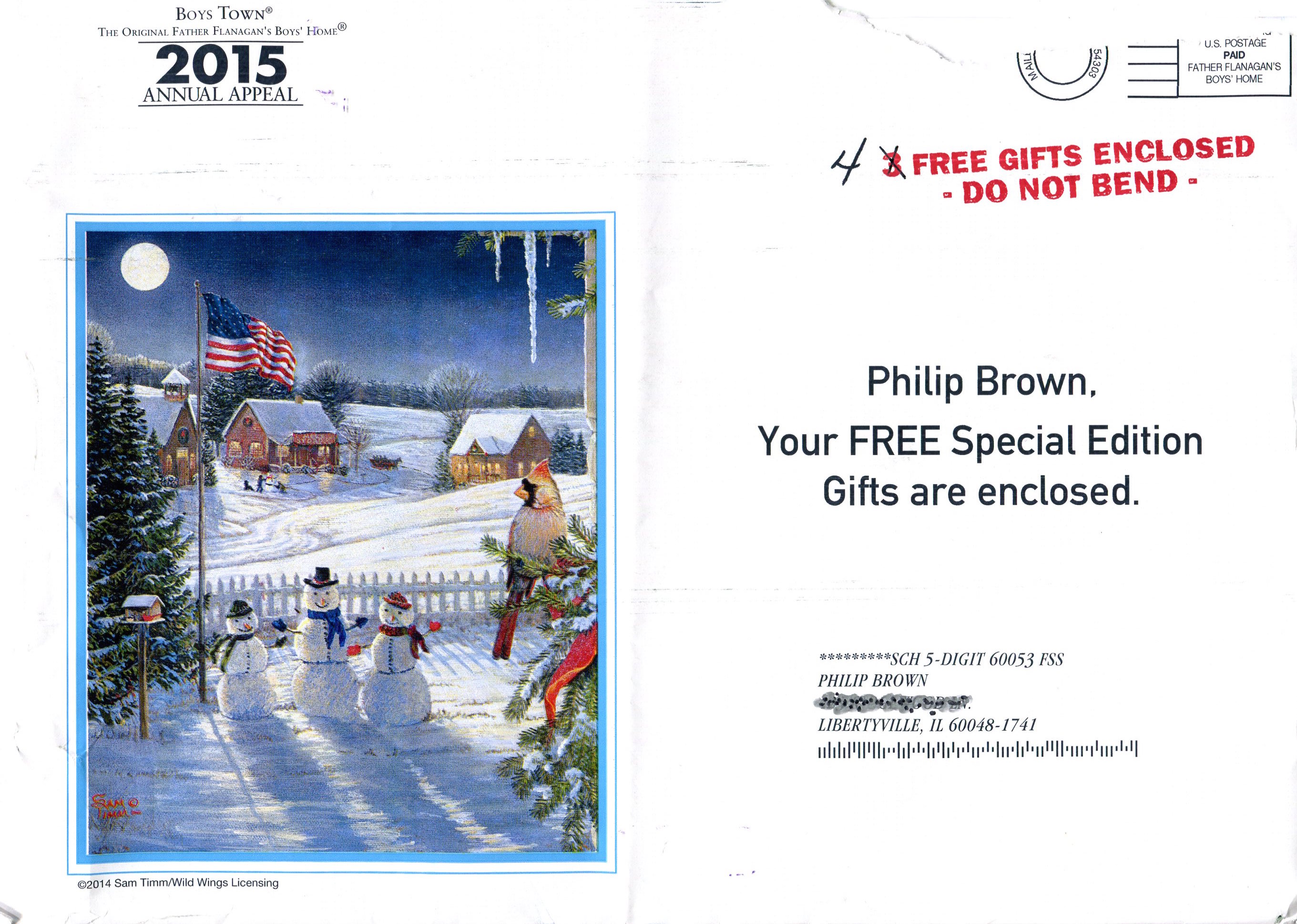
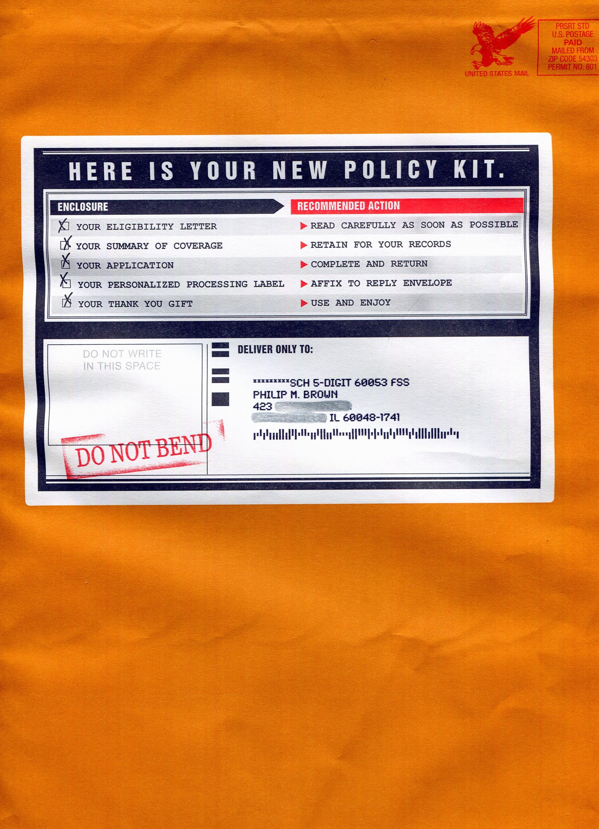
An 11×13 kraft envelope. Pricey, but outstanding in the mailbox.

The AAA insurance offer I just received is a classic example of a winning direct mail design, with an important twist: it’s a fulfillment package. By that, I mean that it fulfills my request for a policy.

Only thing is, I didn’t request it.

If you’ve ever been concerned about getting insurance, procrastination is the obstacle. AAA’s direct mail effort overcomes that challenge. Why it works so well is that it presumes I want coverage.  Like Radar knowing Col. Blake needs a pen before he asks for it.

I don’t need coverage. But there are a reliable percentage of people out there who really do want insurance, and this optimistic kit sets the table very nicely. Here’s how:

1. Trust: being a AAA member, I trust and use the company for roadside assistance, and a pretty much guaranteed 10% off any hotel bill.

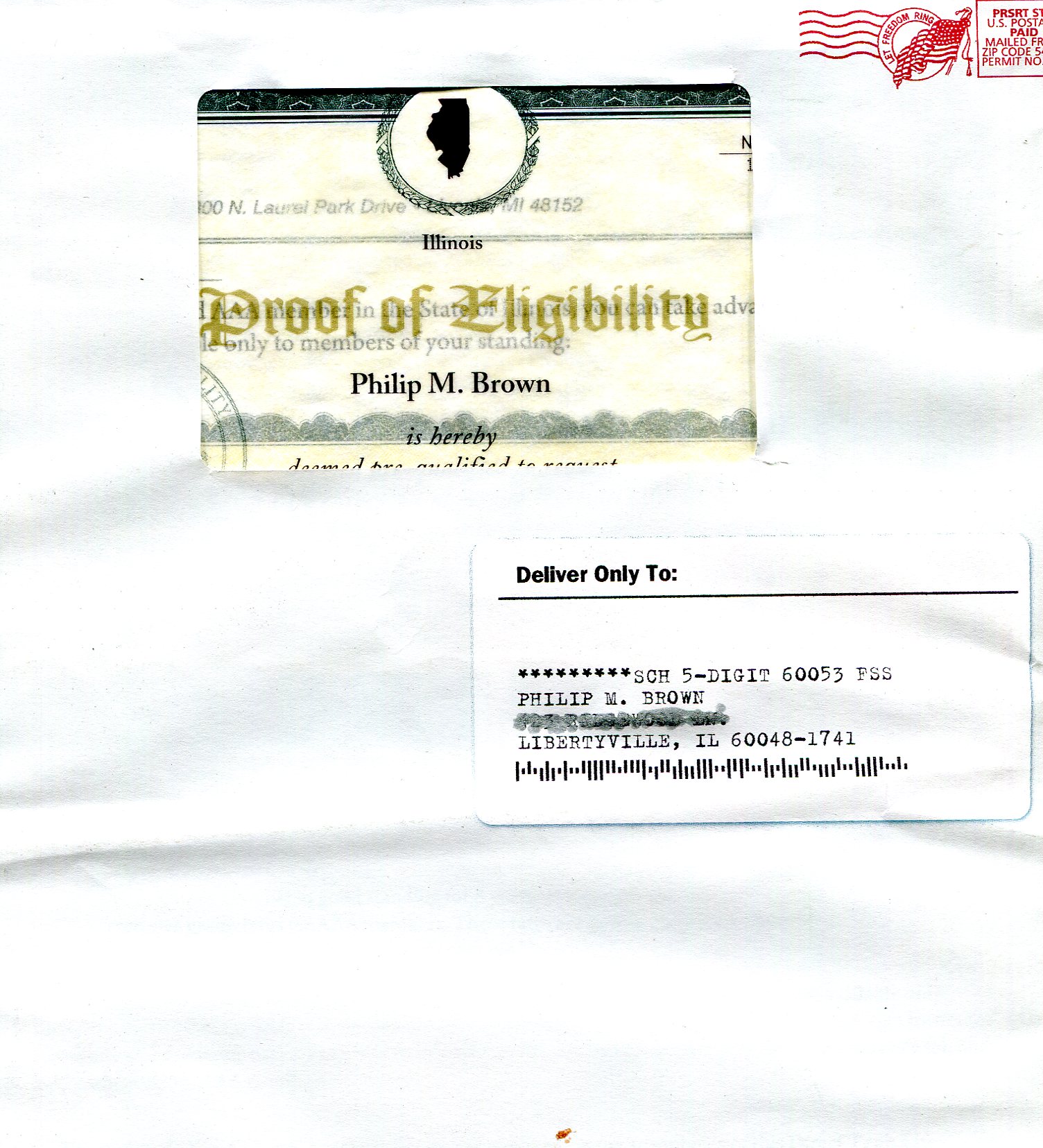
2. The Envelope: unusual, but not weird. It’s big.   AAA is paying USPS a significant postage premium for this over-sized envelope, but as in life, size counts.   It’s kraft brown paper, portrait orientation, and has a “business forms” look about it with side zipper for opening.

AAA 2014-09-06 483 copy

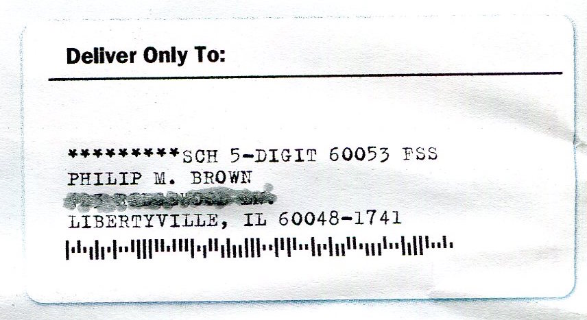
This label sets the agenda: there’s stuff inside, and it’s “yours”.

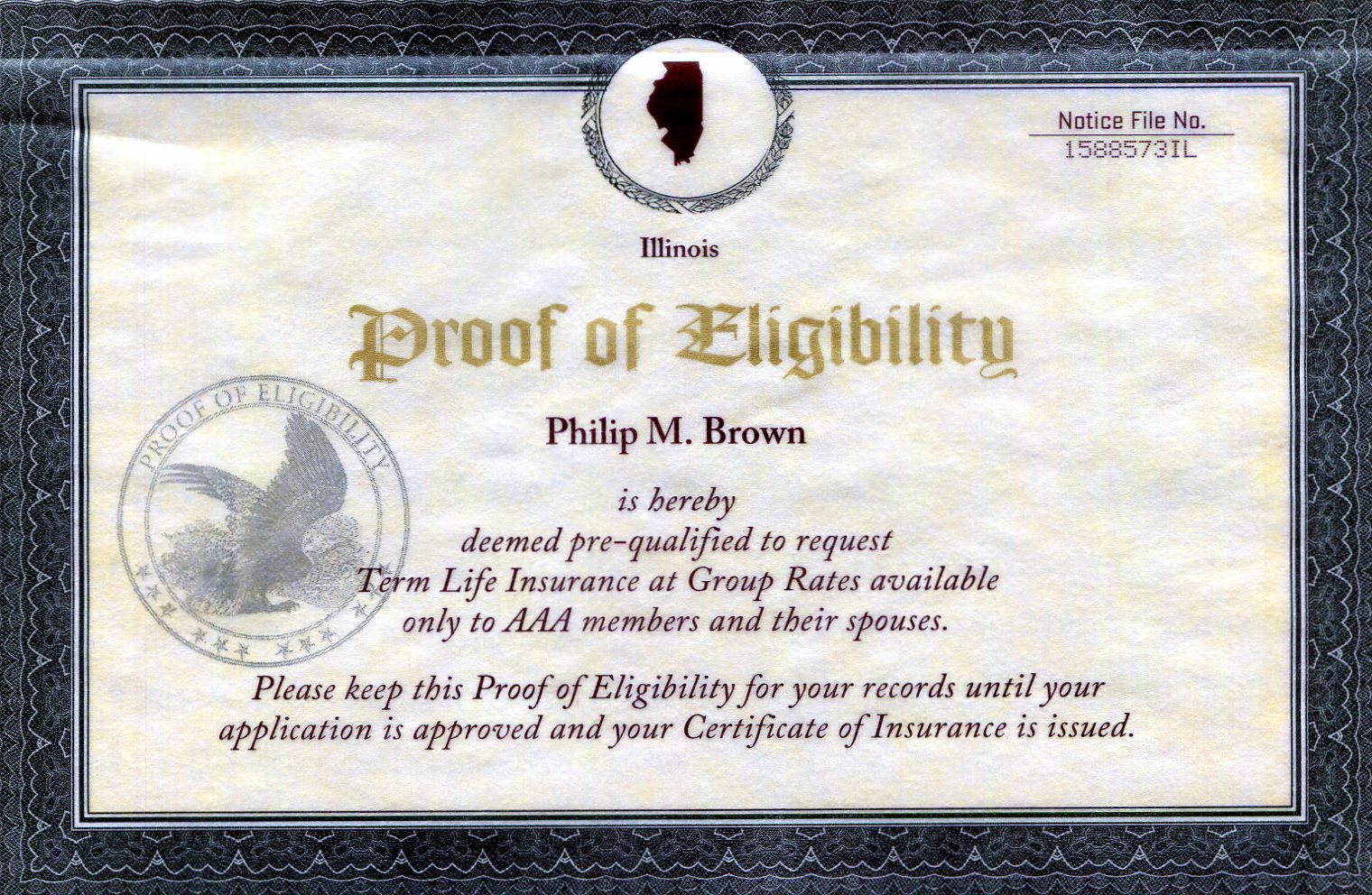
3. The oversized label announces “HERE IS YOUR NEW POLICY KIT”.  Yikes.  What’s this?

4. The manifest: the label details five items inside, including a “Summary of Coverage” which one would infer is already in effect. Amongst other things, there is a “Thank You Gift”, again reinforcing the fait accompli.

5. DO NOT BEND: marketers can only say this if there is a  legitimately unfoldable item within… like a sterling silver name plate… no, sorry, not really, but it does raise our hopes.

AAA 2014-09-06 484

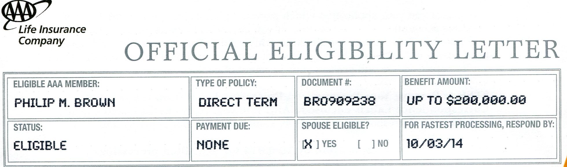
“OFFICIAL ELIGIBILITY” is good enough. The zip strip advises to fold and tear off…as if we needed help.

6. An OFFICIAL ELIGIBILITY LETTER: sounds a little pretentious. I would have dropped “LETTER”. But the title is followed by some computer-generated data dropped into pre-printed boxes.

AAA 2014-09-06 484 copy 2

Evolutionary Throwback: Upper Case Dot Matrix… for the 80’s crowd.

Note the font. Institutional in appearance, it would warm the cockles of any actuary’s heart just to hear the buzz of an 80’s-era dot matrix printer ripping across the page as a cogged wheel advances the continuous form.

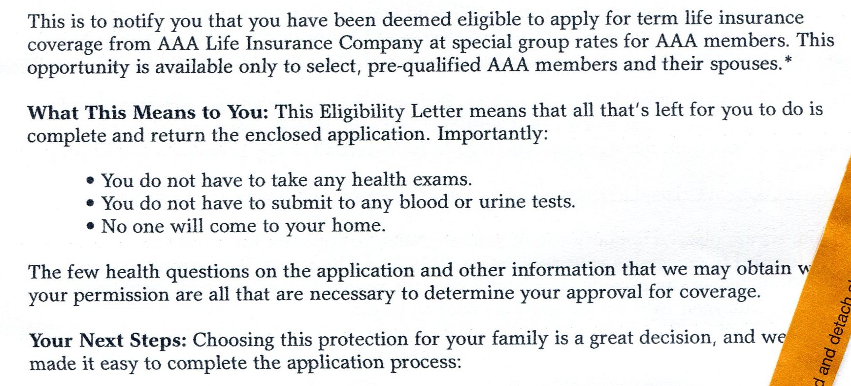
7.   The terse opener: “This is to notify you”

8.   The heads up: “What This Means To You:”

AAA 2014-09-06 484 copy

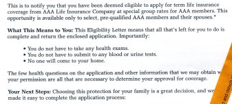
Commanding, but not demanding copy… and risk is eliminated in three bullets.

9.   Three “No Risk” bullets:  there are two kinds of risk in direct mail.   The obvious one is, “getting ripped off”.

The not-so-obvious risk is the personal hassle that follows saying “yes”.   This letter advises there will be no medical exam, no sending samples, and best of all, no sales person.  So we can put the latex gloves away.

10.   Your Next Steps: from here on, the letter simply instructs the reader how to apply.   There are 5 steps, the last being a deadline date which will be reinforced throughout the kit.

AAA 2014-09-06 485

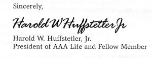
Penmanship fitting for a President!.

11.   Very important: the letter is signed by a titled officer of AAA Life Insurance.   Unfortunately, I think the writer, Harold W Huffstetter, Jr. suspects that I am a nefarious check forger.   If that is his actual signature, I cringe at the zeal and rabid discipline of his 4th grade teacher who taught him penmanship.

12.   A personalized COVERAGE SELECTION CHART.  (Not shown) There are oodles of legal hurdles that surround direct mail insurance marketing– the prospective insured can’t complain for lack of information.   A close look offers a financial pat on the back for non-smokers, though.

Incidentally, dirt cheap prices start at 18 years of age.   Do Millennials buy insurance?   I doubt it, but it entices the Baby Boomer to look on.

AAA 2014-09-06 486

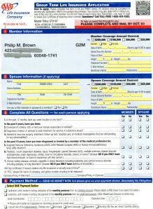
Application is highlighted and well-spaced.

13.   A color-highlighted application form.  Again, this form probably underwent a martyr’s gauntlet of legal reviews.  I like it because it adds color to an other-wise bland package.   And there’s appropriate spacing for names and addresses.

AAA 2014-09-06 486

This QR code (smudged for confidentiality) pulls up my information.

14.   But note the QR code in the upper right corner.   Could it be that I scan that and immediately apply online?  Nope, and a good thing too.   A distracting jump to a website at this point could kill the sale.

In fact, the QR code is for the data-entry folks at AAA.   When scanned, it identifies me, and all the tracking detail attached to my record.

AAA 2014-09-06 490

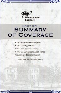
Questions are answered. Note the display of contents.

15.   The SUMMARY OF COVERAGE is explicit.  What is attractive on this piece is the table of contents on the front cover.   This is a benefit piece, and again, is described in plain, low energy language.

AAA 2014-09-06 494

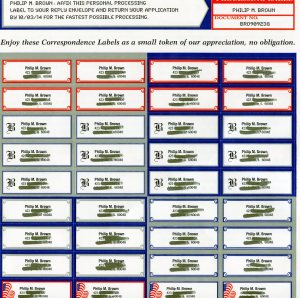
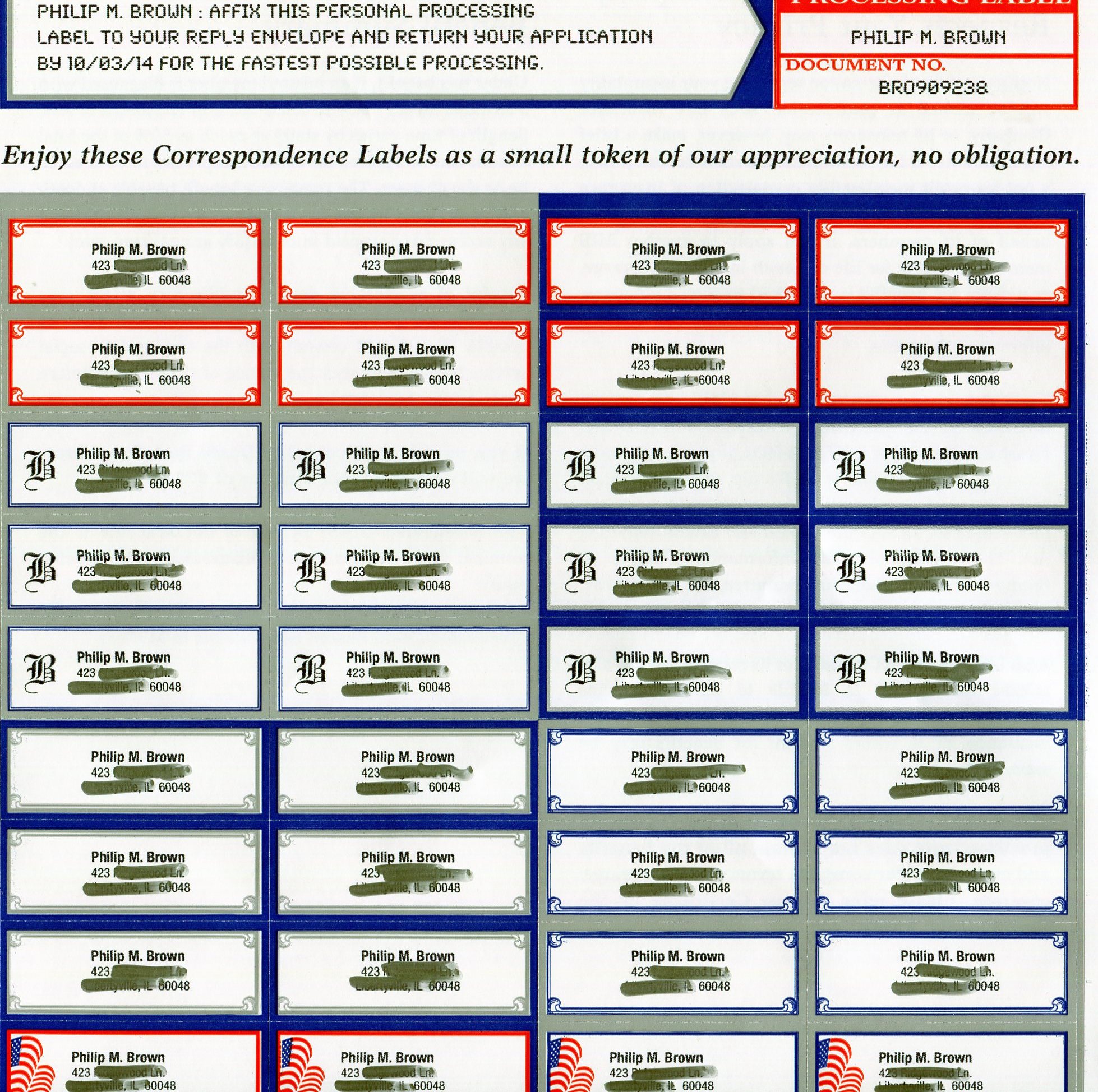
Labels. We will never have enough labels, really!

16.    My Thank You Gift.   This is what everyone looks for in the kit.   The unfoldable item.   Here, the gift is a set of address labels.

You know, there is a future for address labels that extends beyond mailing your next bill payment.

Address labels find themselves on everything portable: cell phones, laptops, tablets, phone batteries, cameras, dog collars, staplers, strollers and DVDs.   If it moves and it’s yours, it could use a label.   Warren Buffet may label every freight car of BNSF Rail some day.

AAA 2014-09-06 495

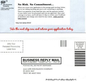
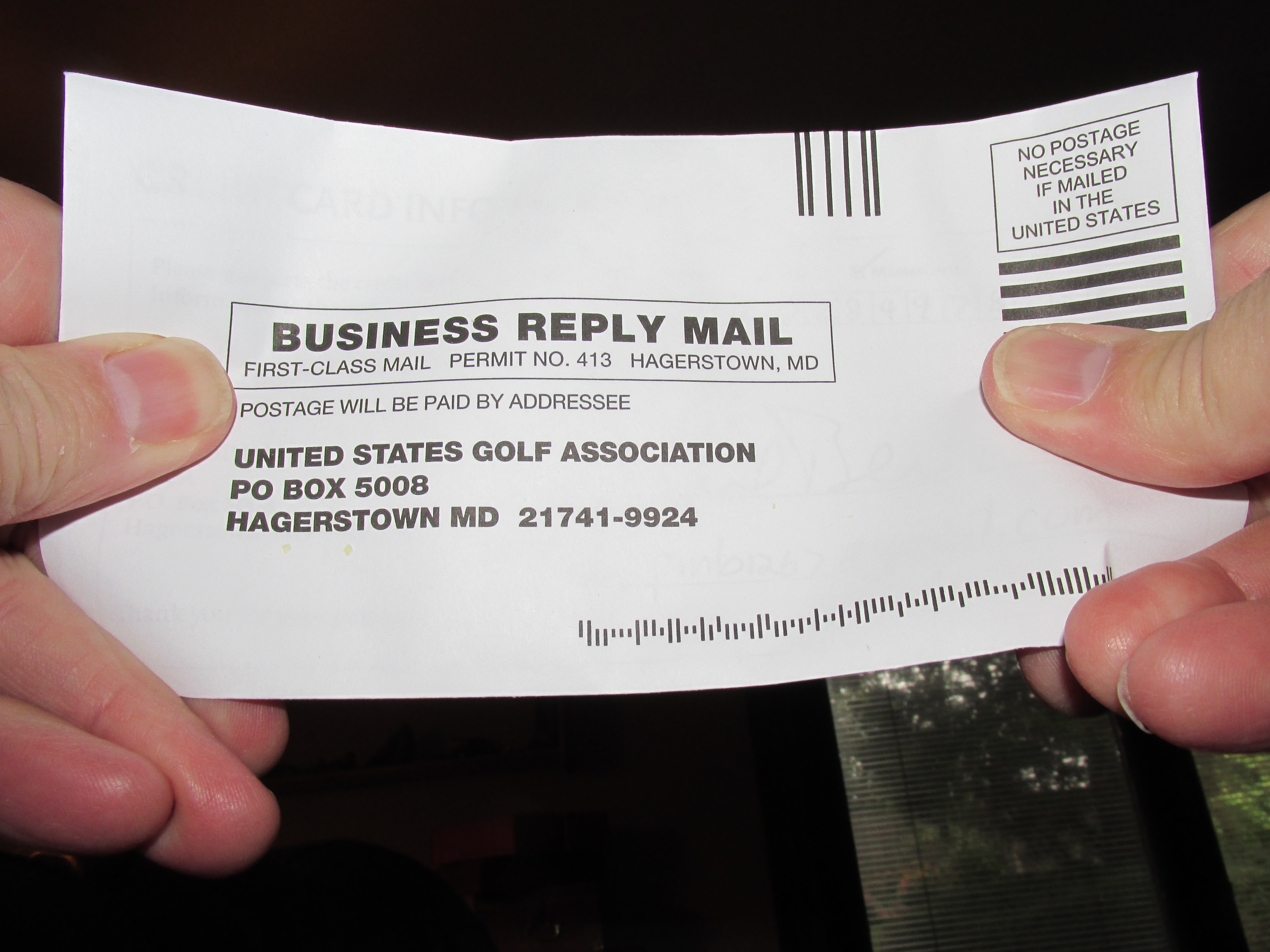
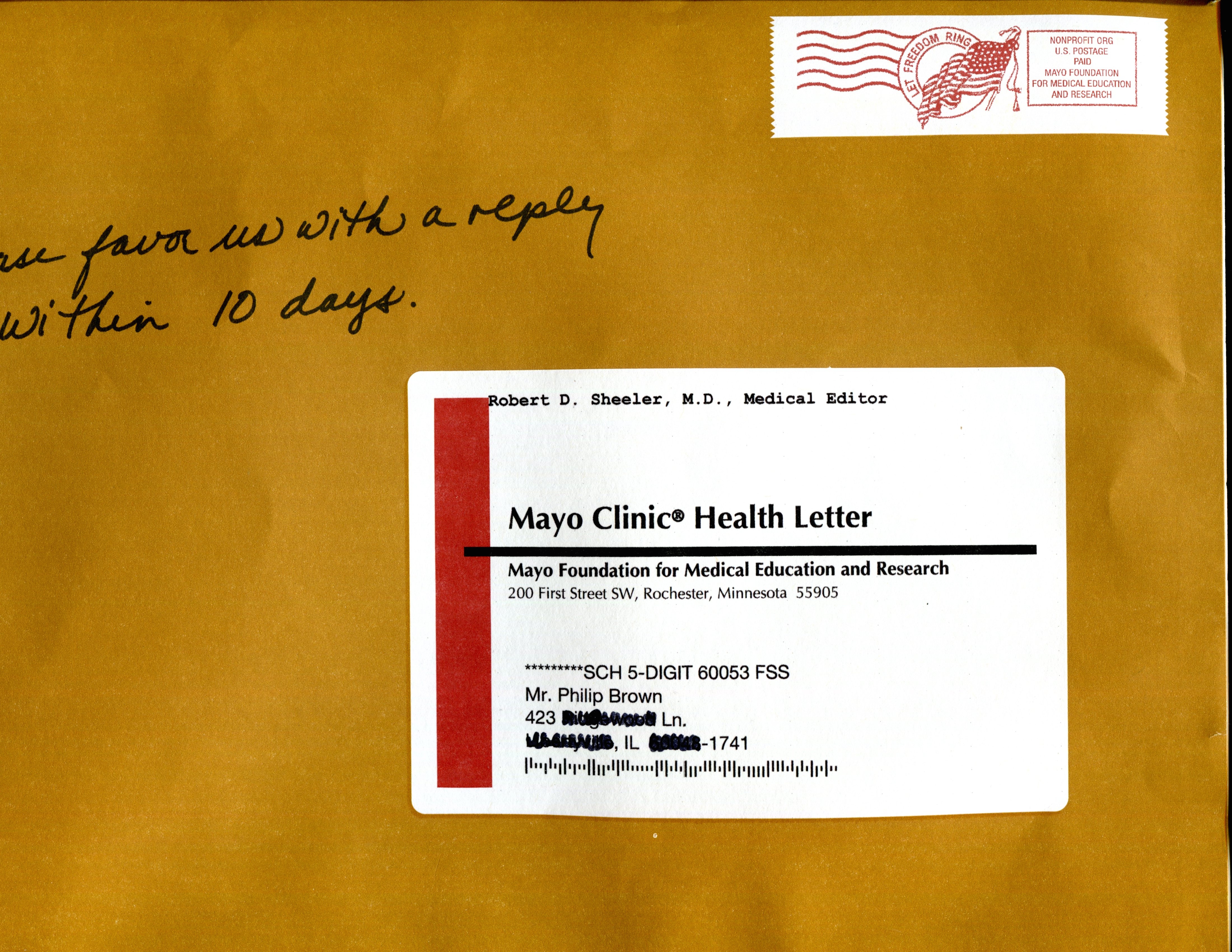
The reply envelope has two perfs. One for tearing, one for folding. Don’t mix them up!

17.   Lastly, a blue reply envelope with motherly reminders to sign and date your application and…AND… to affix your PERSONAL PROCESSING LABEL!

While you may think this is hokey, I bet you a dollar that AAA’s mail box is stuffed with reply envelopes that carry the label, regardless of its seeming irrelevance.   Why?  First, we don’t want to jinx our life karma.  And second, we like to play with sticky things. Honest.

One thing with the reply envelope– I wonder how many get destroyed by confused customers who tear off the wrong perforation.  white_scissors_u2704_icon_256x256A little scissors icon would help.

When reduced to ink on paper, insurance marketing is pretty staid, but consumer friendly.   What it lacks in emotional appeal it makes up in trustworthiness, as this kit demonstrates.   Most important, it didn’t try to sell; it assumed already that I was prepared to apply.

And that’s why it works.


Thanks for taking the time to get to here.   Please pass this along to your direct mail friends.  Thanks!


Standard
direct mail, Marketing

Mayo Clinic: Right On The Money

Smart, effective direct mail design comes from experience, and some times a lot of guts.    The Mayo Clinic Health Letter subscription kit is a classic example.   This masterpiece came to my mail box last month, and while the design may shake you, the numbers will knock you out.   Here’s why:

A Whopping Big Envelope

This one measures 10 x 14 inches.  Really??  Yes.   Why send a little #9 package when

Mayo OE

The envelope becomes the carrier for all the other letters delivered that day.

you can bury the mail carrier with a doormat?   To reinforce the mailing’s impact, the paper stock is nearly cardboard–you could chip a tooth on it–and it’s printed to look like kraft paper.

Creating the kraft look is just the beginning though. The address label is not real, but it is varnished to look like it, and as a special touch, this mass-produced kit has a postage meter label, except–that’s printed too.  The overall presentation says to the reader: “you need to open this now”.

My immediate reaction is:

1.   The Mayo accountants are taking blood pressure tests on both arms in the cafeteria, jabbing at their adding machines, looking for answers.

2.   USPS Postmaster Donahoe is toting up his winnings on this over-sized Flat mail piece.

Long On Words

The extravagance continues inside.   I ripped open the zipper on the envelope to pull out the letter. 8 pages!   That’s four, 8-1/2 by 12-inch

The letter: a lifetime of Tweets.

The letter: a lifetime of Tweets.

sheets, printed front and back.  For you attention-deficient followers, that’s about 198 Tweets.   The CFO is banging out numbers to see how much waste was incurred by using 16-point type instead of 10-point.    Not to mention typing the letter on lined pages!

Nobody reads letters.  Well just about nobody.  Right?

Canary Yellow Reply Envelope

Subtlety doesn’t work in direct mail, even for Mayo.   We can’t just hide stuff in white reply envelopes when we can tell the world we probably have an urgent itch in a better-left-unmentionable place.   So there it is– a large bangtail order form I send back in this shout-it-out yellow BRE.

Yellow BREs never get mislaid.

Yellow BREs never get mislaid. And they get action, too.


Stickers-just to keep it tactile.

Stickers-just to keep it tactile.

Stickers!

The ad agency downtown would never place a sticky label in a mail piece.   How corny.   Yet Mayo does this prominently and proudly, knowing that we can’t resist the temptation.  Does anyone really need to peel a “trial issue” label and stick it on the order form?   Of course we do.  There’s a sense of decisiveness and approval connected to the action, just like updating your car plate ever year.

It’s All About Me

What is irritatingly attractive is Mayo’s continual pandering to my ego.   They have hijacked my name.  Of course, they have it on the envelope, but it’s also on the letter.   And at the top of the letter is a handwritten note addressed to me.   Wow!

The P.S.--after 8 pages, there's still more to say!

The P.S.–even after 8 pages, there’s still more to say!

Again on page 8, up to which, yes, I read, there’s a P.S.  Also written to me.

As expected, the order form has my name, but they slapped it on the flaming yellow BRE just for good measure.

The Story Continues

To dispel any last doubts about the Mayo brothers, they have also included a brochure on the Mayo Clinic just in case I had been hiding in a duck blind too long.   Plus a Post-It note stuck onto the letter quoting readers who bragged about how the newsletter fixed their swollen joints, their riled digestion and unbending digits.

The family story fills in the cracks.

The family story fills in the cracks.

It’s About Making The Numbers

Any cognoscente in the advertising world would roll their eyes at this piece and grab another canapé off the awards dinner banquet table.   Mayo is not going to win a trophy any time soon.

That is because they are too busy depositing checks at the bank.    This package works because it takes enormous advantage of our curiosity.   If you are in the right demographic, you can’t ignore it.

Here are the numbers as I see them.  I have not confirmed with Mayo, but then again, they didn’t ask me either.

It's going to run into money!

It’s going to run into money!

List and production costs have to be at least $350/m. Postage for this Flat, $200/m.   This could be a 55-cent package, all-in.   By the way, while you thought the accountants might have been turning into jelly at that number, it is more likely they are quietly smiling while they top up the USPS Caps account.

Now, response rates.   1% is pretty much the norm, but this gargantuan kit, which includes a gift, could pull a 2% response, which again, I have not confirmed with Mayo.   At 2%, a 55-cent kit delivers a $27.50 acquisition cost. ($0.55/2% = $27.50).  Large, but actually about half of what any credit card sub would cost.   In any event, they wouldn’t do it if it didn’t work.

The Final Number

Medicine aside, Mayo still needs to return a positive cash flow, a.k.a. profit.   An annual subscription to this newsletter is basically $32.00.  Assuming a contribution of $8.00 per sub, Mayo needs to keep the average reader for 3-1/2 years to pay back the $27.50 acquisition cost.

But maybe not.  Because while these 50-year to 80-year-olds, approximately 500,000 of them, are perusing their newsletter, they are also biting on additional offers for Mayo’s entire library of publications. Enough to fill all the waiting rooms in Fort Myers, Miami and Scottsdale for years.

Even if the Mayo Clinic Health Letter program only breaks even, it is the gateway to a flood of peripheral revenues.

Mastering a standout program like the Mayo Clinic Health Letter didn’t happen over night.   These savvy marketers have tested into the present format.   In fact, it could be a test too.

But the numbers are still rewarding, if formidable.  And that’s where the guts come in.


Thanks for reading along on this.  Please let me know you liked it.  And share, too!


Standard
direct mail, Marketing

DAV Makes The Numbers

I just received a mailing from the Disabled American Veterans, whose organization I frequently support.

DAV's Mailing to Past Donors

DAV’s Mailing to Past Donors

The mailing piece is illustrative of the investment DAV makes to raise money for their many services provided to America’s injured war vets.  If you have never received a DAV piece, you have not seen the abundance of gift stuff frequently mailed to potential as well as loyal donors: greeting card sets, bookmarks, calendars, and beautifully crafted address labels.   There’s nothing “junky” about a DAV appeal letter.

IMG_6191

46 cents postage, courtesy of DAV

What struck me about this recent letter was the inclusion of a reply envelope which was already paid with 46-cents of stamps.

Claiming austerity, most fundraisers ask you to provide your own postage.  Instead, DAV pays the bill.   Does it seem contradictory to you?   Or does it make perfect sense?   My guess is that providing the postage is a tactic to increase response, not necessarily the gift amount.   In other words, if a donor normally gives $10, the prepaid return postage tactic doesn’t get more dollars per donor, but it gets more donors: those folks who won’t allow 46 cents to go to waste.  And it’s unlikely many stamps get steamed off.

But here is where it gets interesting: what direct mail manager is willing to put their job on the line by suggesting they add 46 cents to the cost of every fundraising letter they send out the door.   “Are you nuts, or just plain stupid??” suggests their boss, popping TUMS once a minute.

“Riskophilic” may be the proper term.    Daring.  Or canny.  A little bit of math may reveal the truth.

You can look at DAV’s 2012 annual report which shows some numbers worth bragging about.  They earned $97 million in direct mail donations at a cost of $32 million.   Basically, for every dollar spent in direct mail they received 3 dollars in return.   The 3:1 ratio is pretty consistent every year, and by the way, their fundraising cost is only 19% of all their expenses, which is quite acceptable.

Anyway.  The letter I received had 5 Christmas cards and envelopes, a disclosure sheet, a letter, outer envelope and reply envelope.   With outgoing postage, I figure the kit was worth 75 cents in the mail.  $750/m.    Add an additional 46 cents, and you are at $1.21 for one piece of mail.   Multiply that by 100,000 and you have college tuition at Northwestern.

However: increase your cost by 60% and you need to increase revenues by 60%, to keep that 3:1 ratio.   Sounds challenging?   Just about miraculous is how I would define it.   You don’t get swings like that.  But the beauty of direct mail is that you can test it both ways, with and without the extra stamps.   Clearly, the test proved  positive, in a good way, so the DAV is keeping the USPS afloat while making money for its vets.

There’s more at work though.   That crazy manager also has another equation in his or her head.   It answers the question: how much revenue with every piece mailed?   If each piece costs $1.21, then each piece must earn $3.63 in donations.  3:1, right?    But only if DAV gets 100% of the people to respond.   What if only 15% of the people respond?   Then a $3.63 donation won’t cover the ratio.     Now the gift changes, and here’s the revealing equation: $3.63 divided by 15% response.   $3.63/15% = $24.20.   The average donation must be $24.20.

IMG_6190

The “ask” starts at $7.00.

Hmmm.  Look at the donation form on the letter.   DAV is asking for “$7… $10… $15…  or more”.  Whoa!   What if everyone just gives $7 dollars?    Well, again, this is what gets tested, and DAV is pretty confident that a $7 gift is acceptable.   My hunch is that if each gift is at least $7.00, DAV just about breaks even.   How’s that figured? Well, divide the piece cost by 15% response.   $1.21/15% = $8.07 average gift required to break even.  $7.00 is close.

Fortunately, my bet is that people give a lot more.   Without having any direct knowledge of DAV’s results, I can only guess that the scenario is something like what I have described.    And if it is anywhere close, DAV has some very good writers, and some very generous donors.    And some very deserving vets.

A salute to all of them!

Standard